GFXVoid Graphic Design Forum

Remove Text Formatting
Loading...

» Online Users: 8,516

0 members and 8,516 guests
No Members online

» Site Navigation

 > FAQ

» Stats

Members: 35,442
Threads: 103,075
Posts: 826,688
Top Poster: cc.RadillacVIII (7,429)
Welcome to our newest member, Lekelindids
Results 1 to 3 of 3

Thread: New Sig

  1. #1
    Join Date
    Jul 2005
    Posts
    5

    Default


    Comments anyone?

  2. #2
    Join Date
    Jun 2005
    Location
    Virginia
    Posts
    95

    Default

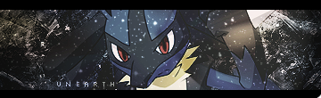
    I think its a little bit too bright. The text could use some work, as well as the blending of the image. I like everything else, though. Looks nice, though.

  3. #3
    Join Date
    Feb 2005
    Location
    United States
    Posts
    891

    Default

    Overall, I think it looks pretty good. The render could be blended in more since the grainy look of the background looks a bit weird with the smooth flames.

Posting Permissions

  • You may not post new threads
  • You may not post replies
  • You may not post attachments
  • You may not edit your posts
  •  
Powered by vBadvanced CMPS v4.1.1