0 members and 483 guests
No Members online

» Site Navigation

» Stats
Members: 35,442
Threads: 103,075
Posts: 826,688
Top Poster: cc.RadillacVIII (7,429)
|
-
-

Yup. welcome back here man.
won't comment too much on the sigs though. I like the 1st, 2nd, and 3rd one. the renders just blend well. and uhh...bleach owns.

-
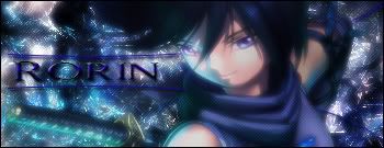
welcome back your sigs have a cool style to em but on the third one i think you've sharend it to much and on you current make the bg slightly more cartoonish to make it fit in with the render
-
Nice sigs, first ones my fav. ^_^
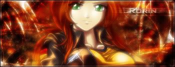
Only things i can see that i would change is the text on your current, which would look better with less bevel, and the text on the last one which needs to be a bit lighter to stand out a bit better against the dark background. 
-
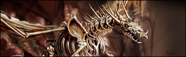
I like the freaky bear! The sig got this sketchy look...
Also the first one is very good! Good job!
-
If ya like it that much go ahead and stick your name on it, 'Kon' is just the name of the bear, lol
and thanks for the comments guys... I know my text blows :/

If everyone cared and nobody cried...
If everyone loved and nobody lied...
If everyone shared and swallowed their pride...
Then we'd see the day that nobody died...
noobdesign.net ftw
-
they're all too blurry, render doesn't blend in on some of them. Good work tho
-
i like the top 2 the best, where do you find these renders?! lol im looking for some likethat
-
-
i like the top 2 the best, where do you find these renders?! lol im looking for some likethat
-
-
they are pretty nice but some of them is from a tutorial from ... chaosgfx right . Not saying its a bad thing though :P cuz they are nice
 Posting Permissions
- You may not post new threads
- You may not post replies
- You may not post attachments
- You may not edit your posts
-
Forum Rules
|


 Reply With Quote


