0 members and 392 guests
No Members online

» Site Navigation

» Stats
Members: 35,442
Threads: 103,075
Posts: 826,688
Top Poster: cc.RadillacVIII (7,429)
|
-


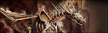
do you like it? didnt spend much time though? well rate please
''AWESOME!!!!!' 9; << ROFL?
-
Verry nice dude , render is sweet :P. The text is actually pretty good and i would give it a 8.2/10
-
Nice brushing and the render looks good but maybe try new colours. 6.8/10
-
-
3/10 bg is more contrasted than the stock
-
First thing thats hits me is how flat it is, no depth at all 
Nothing really matches aswell, looking at it froma designers view it pretty bad, lloking at it from a normal point views it not bad 
-
Rebaz, maybe change the green brushing to an orangy red, then it would match the render and be totally kick ass :P
-
Grow up guys, take it to the PMs.
Alrighty, for some good ole' CnC. Basicly, the blending technique could be improved. Maybe try and make it feel like the render is popping out of the bg, or make it feel like its IN the bg... right now it feels like neither is happening. Also, the contrast in colours, but maybe contrasted a little too much. Usually in sigs since there isnt alot of space you should keep it as uniform as possible. Like the text, overall good work.
Similar Threads
-
By Limitless in forum Digital Art
Replies: 11
Last Post: 04-08-2005, 07:41 AM
-
By Bradley in forum Sigs & Manips
Replies: 2
Last Post: 03-01-2005, 10:26 AM
 Posting Permissions
- You may not post new threads
- You may not post replies
- You may not post attachments
- You may not edit your posts
-
Forum Rules
|


 Reply With Quote
