0 members and 706 guests
No Members online

» Site Navigation

» Stats
Members: 35,442
Threads: 103,075
Posts: 826,688
Top Poster: cc.RadillacVIII (7,429)
|
-

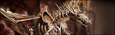
well, while i was doing a sig, it come out like crap, but i want to know how you opine

-
border is crap >.< , but the background is pretty nice, try making a lil bit more variation ( with brushes ) in the background ... 7/10
-
i love the render and the text effects try a diff border
-
-
2/10 bg isn't that good, you just lowered the opacity of the stock, and the tech border is wayyyyy too big
Don't like the size of your sig either
-
TSM, try putting a bit more detail in your BG, this could become a good sig!!!!. resize it, make it smaller, also wat you can do, is duplicate the render, and then go to filter>pixelate>fragment, then put tour original render laer above the one you just pixeated, instead of pixelating it, you could go to blur and motion blur or gaussian blur, experiment with the diff. filters. the border isnt nice change that, maybe a 1px dark blue stroke? or black. the text, what you could do is make it black, take away the duplicated text underneath it and change the font to TIMES NEW ROMAN or ARIAL and put it in the top left hand corner.
hope this help:
Similar Threads
-
By Sumomo in forum Sigs & Manips
Replies: 1
Last Post: 02-23-2006, 07:57 AM
-
By Bender in forum Sigs & Manips
Replies: 2
Last Post: 02-08-2006, 06:41 AM
-
By Freak in forum Sigs & Manips
Replies: 8
Last Post: 11-20-2005, 05:35 AM
 Posting Permissions
- You may not post new threads
- You may not post replies
- You may not post attachments
- You may not edit your posts
-
Forum Rules
|


 Reply With Quote