GFXVoid Graphic Design Forum

Remove Text Formatting
Loading...

» Online Users: 3,056

0 members and 3,056 guests
No Members online

» Site Navigation

 > FAQ

» Stats

Members: 35,442
Threads: 103,075
Posts: 826,688
Top Poster: cc.RadillacVIII (7,429)
Welcome to our newest member, Lekelindids
Results 1 to 8 of 8

Thread: newest sigs

  1. #1
    Join Date
    Jan 2006
    Posts
    117

    Default


    No brushing on most/all of them
    oh yeah Rabieshund is ugly. :lol:

  2. #2
    Join Date
    Jun 2005
    Posts
    2,598

    Default

    Heh maybe an overkill on pink, but thats alright 
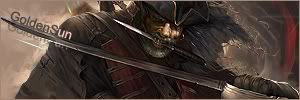
Personally I like them all! Your text is very nice in them all. Pink doesnt suit the crazy zombie looking thing to well :P Some are a little plain and render blending could be better but nice job. I think the last is my fav.
    This is me.


  3. #3
    Join Date
    Jun 2005
    Location
    Dream Fountain, RobocamelTown, 123-Fake Street!!
    Posts
    20

    Cool

    I loved the Halo sig, and that pirate sig as well . But, go easy on the pink would ya?

  4. #4
    Join Date
    Nov 2005
    Posts
    270

    Default

    yeah the Halo is the best for me, the lighting on it is awsome

    the other ones are cool too except for the zombie one, is weird :P

  5. #5
    Join Date
    Feb 2006
    Posts
    61

    Default

    well, the only prob is that some of them have too much brightness, but besides that i like 'em all

  6. #6
    Join Date
    Feb 2006
    Posts
    244

    Default

    all of your sigs look blurry :S apart form the pirate one tahts pretty good
    but th ehalo ones lighting is awsome as some peopel ahave already said

  7. #7
    Join Date
    Jan 2006
    Posts
    117

    Default

    Ty ty, the pirate one is my fav too. But what doy ou mean by blurry? The render or the whole sig?

  8. #8
    Join Date
    Aug 2005
    Location
    Pacific Northwest
    Posts
    1,519

    Default

    The 4th one down is pretty sweet man! Some of the bottom ones are pretty simplistic. Just looks like c4d on lighten with a stock and some slanted text. Try to add more detail and give them depth.

Similar Threads

  1. Newest Sig
    By HeadShot in forum Sigs & Manips
    Replies: 3
    Last Post: 08-23-2005, 04:24 PM
  2. Newest Sig
    By KlngMe in forum Sigs & Manips
    Replies: 6
    Last Post: 07-29-2005, 10:02 AM
  3. Newest Sig
    By whutitdew in forum Sigs & Manips
    Replies: 1
    Last Post: 07-26-2005, 09:56 PM
  4. Newest Sigs
    By whutitdew in forum Sigs & Manips
    Replies: 12
    Last Post: 07-23-2005, 06:45 AM

Posting Permissions

  • You may not post new threads
  • You may not post replies
  • You may not post attachments
  • You may not edit your posts
  •  
Powered by vBadvanced CMPS v4.1.1