0 members and 959 guests
No Members online

» Site Navigation

» Stats
Members: 35,442
Threads: 103,075
Posts: 826,688
Top Poster: cc.RadillacVIII (7,429)
|
-

In this tutorial, I will show you how to make a pattern (usually a diamond-like look) and then make it look as if there is a colorful light coming from behind.
1. Open a new document. I used 500x500, but you can use any size you want.
2. Make sure that your foreground color is black, and background white. You can change it by either pressing D on your keyboard or clicking on the two small boxes under the large two that are layered on eachother.
3. Filter>Render>Clouds, then Filter>Render>Difference Clouds. Then press Ctrl+F or go Filter>Difference Clouds 20-22 times (Command for Mac users).
4. Filter>Distort>Ripple. Change the amount to 500 and make sure it says "Medium" in the drop-down box. Then press Ctrl/Cmd+F or go Filter>Ripple again.
5. Duplicate the layer. Do this by either pressing Ctrl+J, right click on the layer and select "Duplicate Layer" or Layer>Duplicate Layer.
6. Edit>Flip Horizontal.
7. Change the blending mode to "Lighten." If you don't know where the blending mode is, click here.
8. Then merge the layer by pressing Ctrl+E or Layer>Merge Down. Then duplicate the layer again.
9. Edit>Flip Vertical for the new layer. Then change to lighten, just like in step 7.
10. One again, merge together, and duplicate.
11. Edit>Flip 90CW. Change to lighten then merge.
12. Duplicate again. Click on the eye of the new layer so to hide it, then click on the bottom layer, and go Filter>Blur>Radial Blur. Then apply these settings:
Amount:100
Blur Method: Zoom
Quality:Best
13. Click on the top layer, reclick where the eye was so to make it visible, then change the blend mode to lighten. Then flatten your image.
14. Now all you have to do is add color. You can either use Color Balance or Hue/Saturation. Get these by going Image>Adustments>Color Balance or Hue/Saturation. You can also go Ctrl+B for Color Balance or Ctrl+U for Hue/Saturation.
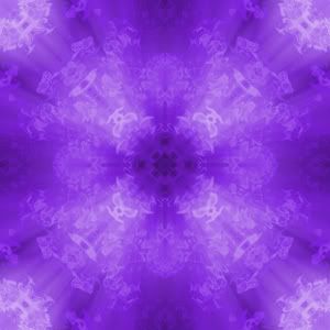
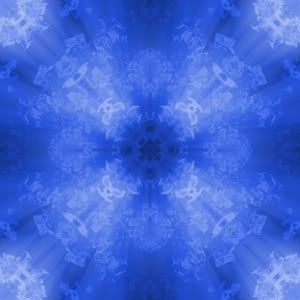
I usually vary with both with each tutorial, because sometimes Color Balance seems more suiting, other times Hue/Saturation seems to work better. These two were the results I came-up with when typing out these steps, and made one purple and one blue (Hue/Saturation). (Both images sized down to 300x300.)
-

Outcome looks cool, more screenies would be nice. With proper coloring and a little manipulation it could make a very nice bg for a sig.
This is me.

-
Sorry I'm still getting used to this with the screens...I'll make sure my next one has more screenshots. But thanks. 
Similar Threads
-
By sonoma in forum Other Tutorials
Replies: 4
Last Post: 07-09-2006, 04:32 PM
-
By Twan in forum Other Tutorials
Replies: 7
Last Post: 01-08-2006, 09:22 PM
-
By dereko04011 in forum Other Tutorials
Replies: 13
Last Post: 08-30-2005, 03:23 AM
 Posting Permissions
- You may not post new threads
- You may not post replies
- You may not post attachments
- You may not edit your posts
-
Forum Rules
|


 Reply With Quote