0 members and 635 guests
No Members online

» Site Navigation

» Stats
Members: 35,442
Threads: 103,075
Posts: 826,688
Top Poster: cc.RadillacVIII (7,429)
|
-


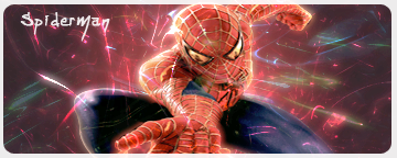
Comments, i think these turned out quite well
Thx ark for telling me how ta do cut out 
-
The first one is a bit over-contrasted. I'd say I like the second one the most except I think you should add a 1 px border around it. Good Job.
-
2nd one is best
i see you put that advice i gave u to work looks good
just need to change font, and maybe color of text
-
There's no need for a border imo. The render looks squished though, and the C4D is random. Work on flow.
-
I like the boarder, makes it look better, Render is just a tad bit squished, but i dont feel like fixing it, and i wasnt go for c4d flow, i was going for a c4d spladder effect,
-
Well, it's a mess. Hey, you asked for comments.
Similar Threads
-
By OpticoN in forum Sigs & Manips
Replies: 5
Last Post: 10-22-2005, 08:59 PM
-
By Tyson in forum Sigs & Manips
Replies: 5
Last Post: 09-27-2005, 09:47 AM
-
By jerner in forum Digital Art
Replies: 3
Last Post: 09-19-2005, 07:57 AM
-
By Guardian in forum Sigs & Manips
Replies: 2
Last Post: 09-16-2005, 02:40 PM
-
By Juicy in forum Sigs & Manips
Replies: 11
Last Post: 05-09-2005, 11:37 AM
 Posting Permissions
- You may not post new threads
- You may not post replies
- You may not post attachments
- You may not edit your posts
-
Forum Rules
|


 Reply With Quote


