0 members and 830 guests
No Members online

» Site Navigation

» Stats

Members: 35,442
Threads: 103,075
Posts: 826,688
Top Poster: cc.RadillacVIII (7,429)
|
-

In this tutorial, we will be making a picture in photoshop that could be used as a logo for a business.
1. Open a new document in Photoshop. I suggest a size at least 400x400. I went with 500x500. Make sure to have a white background.
2. Press D to make sure you have your default colors. Select paintbrush and set your brush to a "soft brush" in the top bar. For my picture I selected size 27.

3. Make a swirl on the document.

4. Go to Filter>Distort>Wave. Click "randomize" until you are satisfied. Click ok.
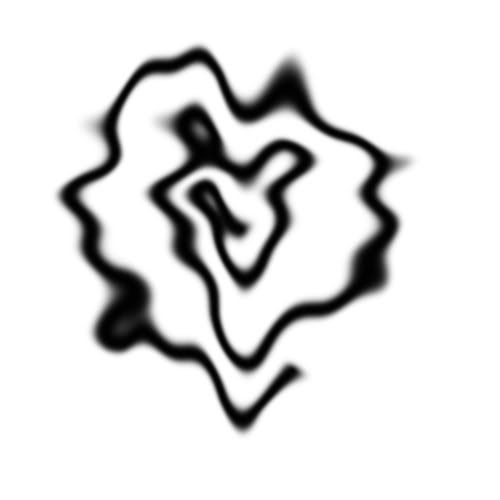
5. Duplicate the layer. Either right-click on the layer and choose "duplicate layer" or click ctrl+J. Then go to Edit>Transform>Horizontal. Change the blending mode "normal" to "darken." Then flatten your layer. Go to Layer>Merge Down or ctrl+E.
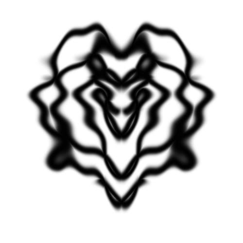
6. Once again, duplicate your layer. This time, go Edit>Transform>Flip Vertically. Change the blending mode from "normal" to "lighten." Flatten your layer.
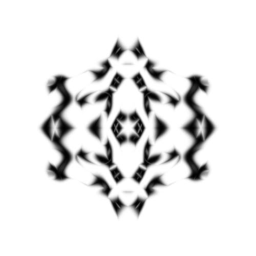
7. Once more time, duplicate the layer. Go to Edit>Transform>Rotate 90 Clockwise. Change the mode from "normal" to "darken" or "lighten," whichever pattern you like better. (I chose "darken" for mine.) Flatten the image.

8. (Optional Step) If you would like to add some color to the logo, go to Image>Adjustments>Color Balance or press ctrl+B. Play around with the settings until you get something you like. Press ok.

9. A lot of times the canvas size is now too large. I've found that most times taking 100 px off of the width and height works. Experiment with what you feel would work best for your image. Go to Image>Canvas Size and change it from inches to pixels. If you end-up cutting off part of your image, either click ctrl+Z or go to your history palette on the right side of the photoshop window (if not open go to Window>History if "History" does not have a check on its left side) and click one step up from "canvas size" and it will return to the previous size.

10. You can stop here if you'd like, but if you'd like to add some extras, such as text, you can continue on. Click on your text tool in the tool palette on the left of the photoshop screen, and click where you would like to add your text. Then double-click on the text layer to open "blending options" or right-click on the layer and select "blending options." (If you double-click and instead the words highlight, enter something short, such as "text" or "words" press enter/return, then double-click again, away from the text. This way, the "blending options" box will open.) With this, you can add some extra effects to the text to give it more interest.

Similar Threads
-
By sonoma in forum Other Tutorials
Replies: 2
Last Post: 06-24-2006, 02:17 AM
-
By Dennu in forum Digital Art
Replies: 2
Last Post: 01-16-2006, 01:18 PM
-
By Twan in forum Other Tutorials
Replies: 7
Last Post: 01-08-2006, 09:22 PM
-
By dereko04011 in forum Other Tutorials
Replies: 13
Last Post: 08-30-2005, 03:23 AM
-
By GodSquad in forum Digital Art
Replies: 10
Last Post: 07-29-2005, 06:54 AM
 Posting Permissions
- You may not post new threads
- You may not post replies
- You may not post attachments
- You may not edit your posts
-
Forum Rules
|


 Reply With Quote