0 members and 8,078 guests
No Members online

» Site Navigation

» Stats
Members: 35,442
Threads: 103,075
Posts: 826,688
Top Poster: cc.RadillacVIII (7,429)
|
-
-

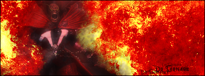
the font looks a little pixelated, but i like the actual font. and the font needs to be ontop of the watermark looking thing (pentogram) and while on the topic, the pentogram looks a little pixelated. i don't think the render on the left really goes with the overall feeling. the shine on the leather jacket really throws off the colors. the brushing on the bottom of the page, the smudgy effect, it's really random. it doesn't exactly go with the whole image. but what i like...i like the render on the left a whole lot. the way you've blended it, it's just awesome. the render in general is awesome. anyways, just a few kinks to work out, but it's a work in progress!  keep it up! keep it up!
:EDIT:
Also the brushing in the background is raw man. it's sick! i really like it. ;D
-
Yes, deffinantly a work in progress. It was basicly a whole mash of everything i know how to do ^^. which often in it's self doesnt mix well. Im still workin on how to strech stuff while keeping it clean. Photoshop font size only goes up to 72 or somthing like that and it just doesnt cut it on a 1280x1024 picture size.
I'll try workin on lighting more.
"Thats right and God wills it!"
-
want bigger font that 72? Highlight your font and hold SHIFT AND CTRL and then press either < or >. < makes your font smaller, and > makes your font bigger...
neat little trick, eh?
-
 Originally Posted by Galazilron
want bigger font that 72? Highlight your font and hold SHIFT AND CTRL and then press either < or >. < makes your font smaller, and > makes your font bigger...
neat little trick, eh?
I hate you. . .
Kiddin
"Thats right and God wills it!"
-
manually type in a figuar :P i go up to 150+ sometimes, and if i want a certain letter, 300 sometimes. i love DMC, but im not current on it (i have no idea who the guy on the left is). ya, i would say start revising it generally, work on a lil of everything
 Posting Permissions
- You may not post new threads
- You may not post replies
- You may not post attachments
- You may not edit your posts
-
Forum Rules
|


 Reply With Quote


