0 members and 1,905 guests
No Members online

» Site Navigation

» Stats
Members: 35,442
Threads: 103,075
Posts: 826,688
Top Poster: cc.RadillacVIII (7,429)
|
-
 My Work **NOT 56K FRIENDLY** My Work **NOT 56K FRIENDLY**
i decided to post all the stuff i liked over the years of designing...enjoy


-------


-------
first forum banner: (rearry large)

a crappy sotw sig

a thing i made to represented wat i use (gonna add to sig later)

a doom3 sig

children of bodom banner (big)

tribal sig

forum banner

war world sig

beavis sig for friend

family guy sig

--------


--------
first try with grunge

affiliate

-------
was the best set i ever made (used to have lens flare go across the name and back, but was too big so i had to make it blink)


---------
-----
forum sig


------
game contest

-----
kikaider(old name) set


------
old sig made for forum

-----
first set i had for old gfxvoid


------
--------
sotw contest on other forum


----------
background for other forum

splash for site

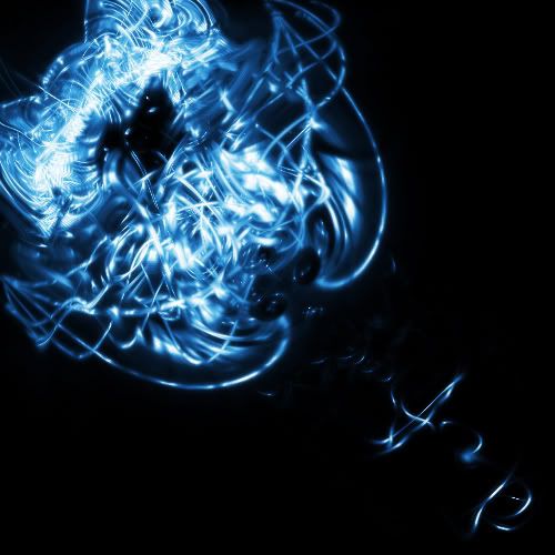
best abstract i made

----
sig i first had for kikaider (friend made it animated, but colors got desaturated)


-------
infinti block for site

PSP graphic

PSP block

best PSP wallpaper

----
first EVER set i had (thx to best friend steven)


-----
and first ever sig

its amazing how i still have that..a good memory! o man, the memories haha
well i hoped u enjoy the long loading of these pics, and im happy if u guys actually looked at all of them
tell me what u think if uve seen me get better over the years (bottom to top)
thx, trevor
:.:eNtEr:A:dIfFeReNt:WoRLd:In:LeSs:ThAn:A:bLiNk:.:
-
I don't have much time atm but your third piece is my fav it's light in color. border goes great with bg and text goes alright.
Something you might want to know this isn't a place to show a gallery of your work, also it's not a place for bigger artwork. Only signatures and avatars as the name of this forum implies.
Some nice work, but watchout where you put it :P some will chew you out for it.
-
too bad they dont just name it "showoff" section
o well its first mistake, sry everyone
btw thx for the complement
:.:eNtEr:A:dIfFeReNt:WoRLd:In:LeSs:ThAn:A:bLiNk:.:
-
for works 24-27, starting with "a splash for site." Did you use this tut?:
http://tutorialoutpost.com/count/5439
cause i made that same thing also from that tut and i got:
and

and both of urs look similar to that.
-
WEll. You say over your YEARS Designing. Then this is still quite poor quality work, i mean, i've been using photoshop about 6 months really... and i've seen complete beginners, including myself, come up with this level of work. So, if i'm honest.. not much improvement. I think that's down to style though.
Maybe you should try some other techniques, or methods other then signature creaiton, and filters, and photoshop tools. Most of them generlaly don't help. Filters give really bad quality effects most of the time.
-
Ok work. I have used that DMC render before, lol.
-
I have to agree with Dale here. Over years, that's pretty poor quality of work. Try doing more "advanced" features in photoshop, and designing something more worth-while.
-
lol Dale's the Simon Cowell of my work...
but i dont blame u, mostve my work is filters and transforming and brushes...
i need to learn more on how to do advanced techniques or w/e u guys are talking about...like dales sig is hott, but i have no clue how ya made it...looks like u took straight lines, sheared him, and just turned em on there side...
well if u guys led me to some tutorials on more advanced..im sure id get some better work..
and yes that is the same tutorial, but i used the one that wasnt ripped from everyone
i got the original guy..but yeah that was my fav tutorial
:.:eNtEr:A:dIfFeReNt:WoRLd:In:LeSs:ThAn:A:bLiNk:.:
Similar Threads
-
By sasuke_inactive in forum Sigs & Manips
Replies: 2
Last Post: 05-31-2005, 09:37 PM
-
By dmiller in forum Sigs & Manips
Replies: 6
Last Post: 05-21-2005, 03:46 PM
 Posting Permissions
- You may not post new threads
- You may not post replies
- You may not post attachments
- You may not edit your posts
-
Forum Rules
|


 Reply With Quote


