GFXVoid Graphic Design Forum

Remove Text Formatting
Loading...

» Online Users: 4,169

0 members and 4,169 guests
No Members online

» Site Navigation

 > FAQ

» Stats

Members: 35,442
Threads: 103,075
Posts: 826,688
Top Poster: cc.RadillacVIII (7,429)
Welcome to our newest member, Lekelindids
Results 1 to 2 of 2

Thread: First..

  1. #1
    Join Date
    Jan 2006
    Location
    Perth, Western Australia, Australia
    Posts
    36

    Default First..

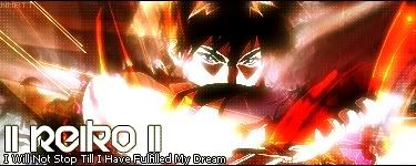
    Ok, i have been a member of gfx void for sumtime, yet i havent really used photoshop. Here are like, my first few creations.. ive only been getting into using photoshop in the last 2 months or so.

    Please leave feedback as i really want to improve myself.
    Thank You, Reiko <3


  2. #2
    Join Date
    Feb 2005
    Posts
    1,777

    Default

    wow :P I haven't seen the dot pattern used in quite some time.

    They look pretty good, you need a full border on all of them though <_<. Seems you have the idea of blending the render into the bg well, nice job.

    The first one needs a bit more depth in the bg, so some more contrasting colors, and the font looks like it should be grunge not tech, since you bg has more of a grunge effect to me.

    2nd one I really like the render motion, but it's colors are way to bright for me but I think that's just me. The bg matches well with this render though it's not blended that much or does seem to. The colors fit perfectly but the render seems to be on top of it not in it. The font should be something that's pretty basic like ariel, rarely in most cases will you need to use a spacific font to match your sig.

    Your 3rd is really nice. The arm is a bit too bright with the contrasting but you have great depth and brushing around the render. Also you've used the dot pattern which actually I think goes with most cartoon/anime looks. Again the font should be basic. On this one it actually seems a bit big and the font just doesn't go well to me.

    Nice work, you have three good pieces of art there . Some basic things, pretty much everything you make like this will need at least 1 pixel border. And for font most of the time stay to the basic fonts and figure a creative way to fit them into your sigs. Other than that good work.

Posting Permissions

  • You may not post new threads
  • You may not post replies
  • You may not post attachments
  • You may not edit your posts
  •  
Powered by vBadvanced CMPS v4.1.1