0 members and 2,214 guests
No Members online

» Site Navigation

» Stats
Members: 35,442
Threads: 103,075
Posts: 826,688
Top Poster: cc.RadillacVIII (7,429)
|
-
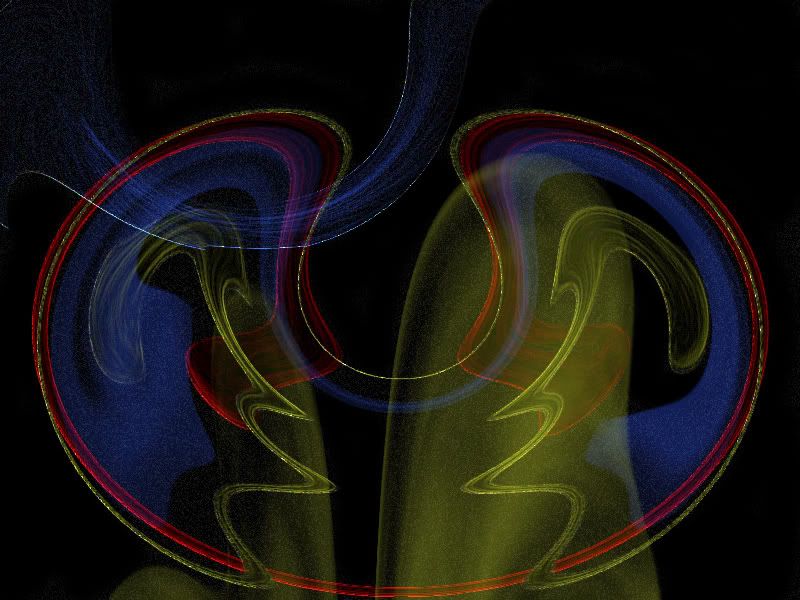
 Abstract art Abstract art
Okay, soooo..yeah. This is my first abstract piece. I know, I used a lot of filters. But yeah. So what?
I wish I was a jellyfish, so I could fly away....
-
Its way too pixely and noisy... Its not really visually appealing at all.(visual art should be visualle appealing so people look at it, and the message is transferred). The colours dont work well with eachother.
Seems like you started messing around filters... then got that result, then you thought, hey that doest look like anything really, ill call it ABSTRACT!!!
uhmm... well how could you improve...........
as i've said to u before, stick with one style so you might actually get really good with it, and then move on. and you know, read tutorials, and dont let harsh comments get you down.... like this one xD
-
Abstract isn't just weird shapes and colours... It actually has to be based on something, or resemble, or make you think about something.
Way too grainy, and the colours don't look too good. What were you trying to acheive ... ?
-
Indeed this isn't abstract art, because this has no meaning or purpose really. Too pixelated as well, and color choice appears random.
Similar Threads
-
By Pleymo in forum Sigs & Manips
Replies: 32
Last Post: 04-17-2005, 12:32 PM
-
By Constricted in forum Sigs & Manips
Replies: 8
Last Post: 03-29-2005, 09:55 PM
-
By Roy in forum Sigs & Manips
Replies: 6
Last Post: 03-28-2005, 12:45 PM
-
By ghetto fab in forum Sigs & Manips
Replies: 7
Last Post: 02-21-2005, 09:35 PM
 Posting Permissions
- You may not post new threads
- You may not post replies
- You may not post attachments
- You may not edit your posts
-
Forum Rules
|


 Reply With Quote