0 members and 15,487 guests
No Members online

» Site Navigation

» Stats
Members: 35,442
Threads: 103,075
Posts: 826,688
Top Poster: cc.RadillacVIII (7,429)
|
-
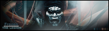
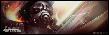
 Oh noes entry Oh noes entry
Last edited by dragoneye; 10-18-2006 at 04:38 PM.
-

that look amazing!!
nice 1
-
Kinda boring with only that sepia tone.  Nice idea, but you should work more with color, or else the viewer will lose interest pretty quick. Maybe the planet is a liiiitle bit too contrasted - it's hard to make out the texture. Nice idea, but you should work more with color, or else the viewer will lose interest pretty quick. Maybe the planet is a liiiitle bit too contrasted - it's hard to make out the texture.
But everything else looks great. :]
-
Wow that's really nice looking  The colours however, are not too nice looking... They just make it look dull. I think the planet takes up a little too much room also The yellowey brown colour = bleugh >.< The colours however, are not too nice looking... They just make it look dull. I think the planet takes up a little too much room also The yellowey brown colour = bleugh >.<
-
i personnaly think the colours look spot on
but thats probably just my preference
-
is it all from scratch, or stock with effects? either way, nice
Latest:
Persian Warrior
Favorite:
The Legion
 GFXVoid
!
-
Its all from scratch, just the planet texture i got from google maps or whatever it is.
I'll mess around with the colors. maybe. I just thought those colors looked nice, i didnt want to overdo it so i guess i underdo-ed(did) it.
and the planet i kinda ment to be contrasted to emphasize the sunshine thingy. But yeah. thanks for the comments ^^ ill post the edited one sometime. xD
edit:
http://img242.imageshack.us/img242/4...nshine2nj7.jpg well. better?
Last edited by dragoneye; 10-18-2006 at 02:04 PM.
-
in my opinion you completly fucked up work with font. idk its special or not, but it looks ugly
-
 Originally Posted by CuBa

in my opinion you completly fucked up work with font. idk its special or not, but it looks ugly
anything else? thats not a real comment yet.
I was pretty surprised that nobody thought the text sucked before you ^^
-
... i did, forgot to mention ^^ lawl
and by the colours, i menat, a colour balance layer doesn't look good...
Similar Threads
-
By Deadloader in forum The Void
Replies: 14
Last Post: 10-16-2006, 04:24 AM
-
By just.xTc in forum Digital Art
Replies: 8
Last Post: 09-10-2006, 12:03 PM
-
By shajn in forum The Void
Replies: 11
Last Post: 08-16-2006, 05:59 AM
-
By ROTD in forum Introductions
Replies: 8
Last Post: 08-05-2006, 02:20 PM
-
By keden in forum Sigs & Manips
Replies: 1
Last Post: 03-11-2006, 03:52 AM
 Posting Permissions
- You may not post new threads
- You may not post replies
- You may not post attachments
- You may not edit your posts
-
Forum Rules
|


 Reply With Quote


