0 members and 2,886 guests
No Members online

» Site Navigation

» Stats
Members: 35,442
Threads: 103,075
Posts: 826,688
Top Poster: cc.RadillacVIII (7,429)
|
-
-

Hi there!
I find they look great. Specially the 2nd. one cool.
Wich style did u used on your sig smudge?
cu
-
ya they r all smudge
Any more comments?
Last edited by Deadloader; 10-18-2006 at 10:01 PM.
Latest:
Persian Warrior

Favorite:
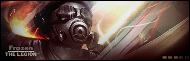
The Legion
 GFXVoid
!
-
Pretty good. Text is the biggest problem though, it isn't well unified in the piece, it's just there. Some variety on it would help too, you're using the same style for every one, and it's not being used very well. Other than that they're fine, first two are the best. Try some multi-colored sigs, mono colors are usually (but obviously not necessarily) a novice style mainly because they're a lot easier to pull off.
-
when you say use variety, you mean use different fonts? styles? position? size? or all? also my next sig I make will be multicolored
Latest:
Persian Warrior
Favorite:
The Legion
GFXVoid!
-
blend your renders more, there are no effects on the renders
-
 Originally Posted by Frozen

when you say use variety, you mean use different fonts? styles? position? size? or all? also my next sig I make will be multicolored
Yes, everything. Colors too.
xander60, not all sigs need effects or blending, the clarity of the stocks on these looks just fine.
-
dude i know that, its a suggestion, i personally think some effects on these would look good.
i think the renders are put a little too cleanly on the bgs, which have a lot of movement in them
i did forget to say that they arent by any means bad sigs tho
Last edited by Xander; 10-18-2006 at 07:00 PM.
-
imo, i dont think the renders need any more blending, i do agree i need to work on text. text is my weakest spot. next sig will be same style, just no monitone layer, and different text. or at least I'll experiment with it. I'll post a new topic with my result tommorow. Also please help me with my result, to help me get it right. I want to improve my sig making the best I can. 
Latest:
Persian Warrior
Favorite:
The Legion
GFXVoid!
-
What i think xander is trying to say is, not that the blending is bad just that your renders all seem to have all these smudged edges and crap and that's it.. and the rest is clean and appears to be that they're just stuck on..
Try to expand your perception on the way signitures are constructed, if you really want to improve take it to the next level.. perhaps a level of higher thought should be incorporated into your newer pieces, i.e some kind of denotation or an experiment with perhaps not how it appears in vision but the thoughts it provokes to the viewer.. whether it be simple or not i'd still give you kudos for trying this.
deaz\dxloa\dxedr

Similar Threads
-
By Ben in forum Sigs & Manips
Replies: 5
Last Post: 03-03-2006, 12:35 PM
-
By Adam in forum Sigs & Manips
Replies: 5
Last Post: 02-06-2006, 12:17 AM
-
By dragonlord in forum Sigs & Manips
Replies: 5
Last Post: 09-29-2005, 02:15 PM
-
By ROTD in forum Sigs & Manips
Replies: 7
Last Post: 07-29-2005, 05:36 PM
-
By Chemical in forum Sigs & Manips
Replies: 3
Last Post: 07-04-2005, 03:02 AM
 Posting Permissions
- You may not post new threads
- You may not post replies
- You may not post attachments
- You may not edit your posts
-
Forum Rules
|


 Reply With Quote


