0 members and 3,748 guests
No Members online

» Site Navigation

» Stats
Members: 35,442
Threads: 103,075
Posts: 826,688
Top Poster: cc.RadillacVIII (7,429)
|
-
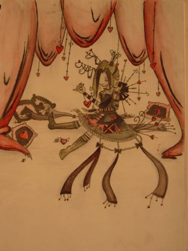
 queen of hearts queen of hearts
pic i did for a contest on DA that amihedgehog was holding
her character, my drawing, done with india ink, pencil archival pen, watercolour and a little bit of prisma colour pencil crayons
-
you draw really emo stuff
i like the coloring tho
-
thanks 
-
This is awesome. The tone of colors really give it a nice feel. Even though some of the shapes seem a bit unproportional, it's really nice. I like the decorations. Good luck in the contest.
-
thanks
it got a bit distorted when i took the picture 
this was the least distorted one though
-
Wow that's pretty sweet, i like the 2 contrasting styles, the curtains look different to the girl. I think i like the style of the curtains more, the shading / rough bold lines  wicked lines and curls everywhere! wicked lines and curls everywhere!
-
You should get a scanner, or maybe try out a tablet!
Good stuff!
-
bahh i don't think proportion is key in this, it's quite an abstract looking person..just don't like the left leg on her.. it's kind of miss shaped compared to the other and the was of where it is.. plus doesn't make it look like she's actually sittign down
deaz\dxloa\dxedr

-
thanks guys
no money for a scanner or tablet
hm, i didnt even notice the leg, i guess it is kinda off
i might have fiddle with it if i hadent gone over it with pen :S
-
Similar Threads
-
By food in forum The Void
Replies: 2
Last Post: 03-31-2006, 11:46 PM
-
By MinorThreat in forum Sigs & Manips
Replies: 15
Last Post: 11-06-2005, 11:49 AM
-
By gugge in forum Digital Art
Replies: 9
Last Post: 10-17-2005, 03:15 PM
-
By gugge in forum Digital Art
Replies: 10
Last Post: 10-09-2005, 09:43 AM
-
By Hazardous_Material in forum Digital Art
Replies: 9
Last Post: 06-19-2005, 07:43 PM
 Posting Permissions
- You may not post new threads
- You may not post replies
- You may not post attachments
- You may not edit your posts
-
Forum Rules
|


 Reply With Quote


