0 members and 982 guests
No Members online

» Site Navigation
» Stats
Members: 35,442
Threads: 103,075
Posts: 826,688
Top Poster: cc.RadillacVIII (7,429)
|
-

Yeah. First try at a smudge-ish-ee type sig. I am not really sure what is considered "good" for this type.. But I thought I'd give it a whack. I think I should fade the text more..
O_o
C&C!!! Argh. Anyways, I editted it. Soo... yeah.
t3h upd473::

Does everyone hate me?
Last edited by Deadloader; 10-23-2006 at 10:25 PM.
Reason: double posting
-
lol XD nah this happens quite frequently.
It's just I haven't been posting around here that much 
lol it's amazing how the leaf brush is some normally the first smudge brush people use.
I was teaching Frozen how to smudge and ends up we got the leaf brush lol though his changed his style since them.
Ok now for the critic 
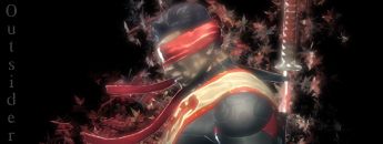
. There's to much negative space in the bg, you need some brushing behind it. Your smudging seems to be done well but it's not blended with your render. You should set the last layer to screen or lighten I believe from the way I think you've done this.
Watch out on text pretty much stick with the basics. Also I would suggest having your text horizontal. You should also sharpen your sig or the render spacifically.
It shows promise but needs quiet a bit of work. 2 big areas that make great smudge sigs are ones in motion, and ones that are like ripping apart the render.
I would actually have to say on this one to scrap it for now and try again with a totally new idea in mind for smudging. Also take a look at the smudge tutorial somewhere in the forums here on the void. It was the 2nd tutorial I looked at when I was try to learn this style and it's done well.
Good Luck pm if you need help.
-
Well, smudging isn't really my cup of tea, so i can only tell you by what i see in other sigs. I think the render sticks out to much, try smuding the edges of the render to get it to stick out less. It seems way to black, and not much time seemed to be spent on filling the sig, so perhaps some more smudging is needed. Overall though, for a first try, it looks pretty good.
Similar Threads
-
By Dale in forum Sigs & Manips
Replies: 5
Last Post: 02-07-2006, 06:15 PM
-
By Sumomo in forum Sigs & Manips
Replies: 9
Last Post: 12-09-2005, 11:23 PM
Posting Permissions
- You may not post new threads
- You may not post replies
- You may not post attachments
- You may not edit your posts
-
Forum Rules
|