0 members and 754 guests
No Members online

» Site Navigation

» Stats
Members: 35,442
Threads: 103,075
Posts: 826,688
Top Poster: cc.RadillacVIII (7,429)
|
-
 spawn spawn
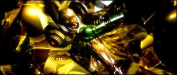
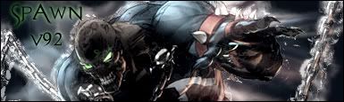
havent been usin photoshop for like a month. anyway im new to this forum. so check dis out. rate and comments plz. much appreciated.
-
-
-
i dont like it too muc, as he said, the text...
try using brushes or C4D
-
damn!!! i knew i forgot sometin!! it was the c4d!!
-
Well, i think that some parts of the render (Spawn), has some little harden lines, and that doesn't look really good, try using smudge tool, with scattering option, that could help to fusing the sig.., the text could be better, and my opinion of the brushes and C4d's is, if u haven't made the 3D render, or the abstract brushes, that wont be your 100% on the signature 
7/10
(I am not really good at english, sorry)
Last edited by :.Sensoku.:; 01-14-2007 at 06:19 PM.


Sen touch!
-
Perhaps if you added some brushing to the bg to give it some depth. The text is way off, i like the font though.
Good job, pretty cool.
Similar Threads
-
By Dragon in forum Sigs & Manips
Replies: 1
Last Post: 10-23-2006, 04:42 AM
-
By GreeneBeast in forum Sigs & Manips
Replies: 4
Last Post: 10-04-2005, 01:34 AM
-
By GreeneBeast in forum Sigs & Manips
Replies: 9
Last Post: 09-05-2005, 01:35 PM
-
By Surfaced in forum Sigs & Manips
Replies: 4
Last Post: 07-25-2005, 09:48 AM
-
By Roy in forum Sigs & Manips
Replies: 3
Last Post: 06-24-2005, 10:30 AM
 Posting Permissions
- You may not post new threads
- You may not post replies
- You may not post attachments
- You may not edit your posts
-
Forum Rules
|


 Reply With Quote
![[PHXN] New001's Avatar](image.php?u=7015&dateline=1264038258 "[PHXN] New001's Avatar")
![Send a message via AIM to [PHXN] New001](http://www.gfxvoid.com/forums/images/misc/im_aim.gif "Send a message via AIM to [PHXN] New001")
![Send a message via MSN to [PHXN] New001](http://www.gfxvoid.com/forums/images/misc/im_msn.gif "Send a message via MSN to [PHXN] New001")
![Send a message via Yahoo to [PHXN] New001](http://www.gfxvoid.com/forums/images/misc/im_yahoo.gif "Send a message via Yahoo to [PHXN] New001")