0 members and 3,513 guests
No Members online

» Site Navigation

» Stats
Members: 35,442
Threads: 103,075
Posts: 826,688
Top Poster: cc.RadillacVIII (7,429)
|
-
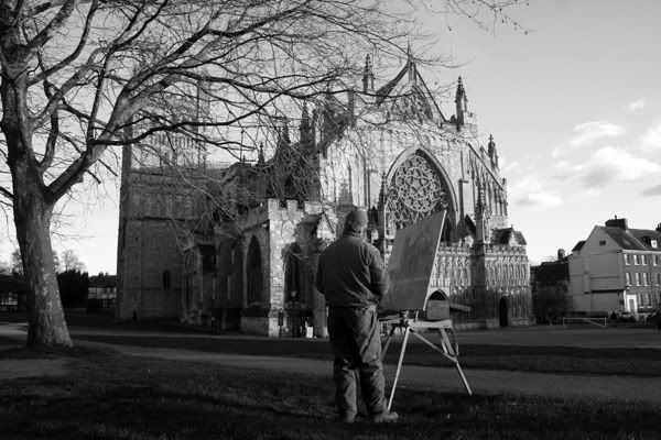
 The Cathedral Artist The Cathedral Artist
What you think?
-
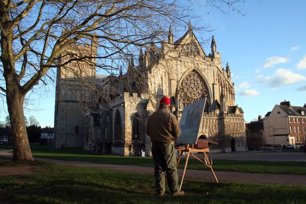
I think you should have used color to make him stand out more. In black and white everything floats together, kinda. I'm liking the concept though. Do you have the color version?
-
I sure do.
-
Liking it much more!  Nice colors. Nice colors.
-
Thanks, any more comments?
-
beautiful sky. nice cathedral, too. also, it looks good without a border, good job for not slapping one on
-
I actually think it's quite funny and odd, the way the cathedral looks completely out of place next to the house, tree and in front of the artist. The tree dwarfs the cathedral, the house next to it makes it look like it's way too old. And the artist in front of it is almost like making fun of it
-konfusion
-
I like it. but the angle seems good, not perfect...
-
ooo very nice
it reminds me of brunelleschis one point perspective
he used a cathedral to test his theory and people were really freaked out by it 
it was one of the four major breakthroughs of the renaissance period
lol, sorry, anyways, i quite like it
Similar Threads
-
By Moji in forum The Void
Replies: 36
Last Post: 03-18-2007, 12:02 AM
-
By Bit in forum Introductions
Replies: 7
Last Post: 09-17-2005, 09:07 PM
 Posting Permissions
- You may not post new threads
- You may not post replies
- You may not post attachments
- You may not edit your posts
-
Forum Rules
|


 Reply With Quote