GFXVoid Graphic Design Forum

Remove Text Formatting
Loading...

» Online Users: 13,414

0 members and 13,414 guests
No Members online

» Site Navigation

 > FAQ

» Stats

Members: 35,442
Threads: 103,075
Posts: 826,688
Top Poster: cc.RadillacVIII (7,429)
Welcome to our newest member, Lekelindids
Page 1 of 2 12 LastLast
Results 1 to 10 of 13
  1. #1
    Join Date
    Dec 2006
    Location
    Newfoundland
    Posts
    108

    Default I Was Away... Sorry

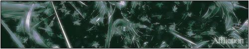
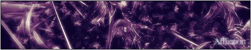
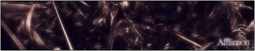
    I had some personal problems and I was away for a while thinking about stuff. Sorry.

    Anyway, here is all my recent work.


    ----------------------------------------------

  2. #2
    Join Date
    Dec 2006
    Posts
    1,270

    Default

    I'm a sucker for those sigs with teh extra shine, I love the affect it gives them
    But that first one I'm not a fan of.
    Its too grainy, and trh transitions in between colors almost makes my eyes hurt.
    You really do some great work, so keep it up
    Fav:


    Newest:


  3. #3
    Join Date
    Dec 2006
    Location
    Newfoundland
    Posts
    108

    Default

    The first one is supposed to look like a painting.

    ----------------------------------------------

  4. #4
    Join Date
    Dec 2006
    Posts
    702

    Default

    I like all but the first. It's oversharpened, in my opinion. But apart from that, it looks like a cool render.

    -konfusion

  5. #5
    Join Date
    Feb 2005
    Location
    Gothenburg, Sweden
    Posts
    3,199

    Default

    Good you're back! Keep it up yo.
    Last edited by dragoneye; 01-27-2007 at 02:47 PM.

  6. #6
    Join Date
    Dec 2006
    Posts
    1,270

    Default

    Quote Originally Posted by VooDooRex View Post
    The first one is supposed to look like a painting.
    Ah, I see how your trying to make it look like a painting.
    But the sharpness IMO makes it look the opposite.
    I would have gone with blurs and accents for that pictuer...
    But ahts just IMO

    Keep up the good work
    Fav:


    Newest:


  7. #7
    Join Date
    Dec 2006
    Location
    Newfoundland
    Posts
    108

    Default

    Thanks. I'll be posting much more now.

    ----------------------------------------------

  8. #8
    Join Date
    Oct 2006
    Location
    Massachusetts, USA
    Posts
    688

    Default

    I love the first one, even with the grain lol. It kinda reminds me of Star Wars Episode 3 when Obi Wan and Anakin are on that plant with all of the lava.

    I also really like the first affliction sig and the last one.

    XBOX Live Gamertag: Merc 106


  9. #9
    Join Date
    Dec 2006
    Location
    Newfoundland
    Posts
    108

    Default

    Yeah, I have an affliction set of graphics I'm doing. It is going to consist of 13 pieces. The first Affliction sig is my favorite too.

    ----------------------------------------------

  10. #10

    Default

    They all look amazing! nice work
    Sincerely,
    David

    visit our site

Posting Permissions

  • You may not post new threads
  • You may not post replies
  • You may not post attachments
  • You may not edit your posts
  •  
Powered by vBadvanced CMPS v4.1.1