GFXVoid Graphic Design Forum

Remove Text Formatting
Loading...

» Online Users: 23,287

0 members and 23,287 guests
No Members online

» Site Navigation

 > FAQ

» Stats

Members: 35,442
Threads: 103,075
Posts: 826,688
Top Poster: cc.RadillacVIII (7,429)
Welcome to our newest member, Lekelindids
Results 1 to 5 of 5
  1. #1
    Join Date
    Nov 2006
    Posts
    129

    Default Age of innocence?

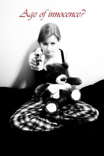
    OK, so 2 questions here.

    1. Which text placement works best?
    2. Which exposure settings work best?

    a. b. c.

    Thanks for the help.

  2. #2
    Join Date
    Sep 2006
    Location
    Australia
    Posts
    185

    Default

    first one i reckon

  3. #3
    Join Date
    Feb 2005
    Location
    Gothenburg, Sweden
    Posts
    3,199

    Default

    I say third one, but contrast is a bit too high.

  4. #4
    Join Date
    Nov 2006
    Posts
    129

    Default

    Tried using a kid's handwriting for text to try and portray the concept a little better. Any comments greatly welcome?

    Better, Worse?


  5. #5
    Join Date
    Dec 2006
    Posts
    1,270

    Default

    The text is good, But the color is random :P
    Use something that goes with the theme, and do some touching to the BG to make her skin distinguished frmo teh wall IMO
    Fav:


    Newest:


Similar Threads

  1. Devilish Innocence
    By Moddy in forum Digital Art
    Replies: 2
    Last Post: 12-20-2006, 06:18 AM

Posting Permissions

  • You may not post new threads
  • You may not post replies
  • You may not post attachments
  • You may not edit your posts
  •  
Powered by vBadvanced CMPS v4.1.1