0 members and 5,659 guests
No Members online

» Site Navigation

» Stats
Members: 35,442
Threads: 103,075
Posts: 826,688
Top Poster: cc.RadillacVIII (7,429)
|
-
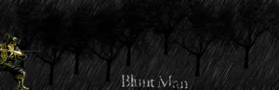
 Hey guys l know this sig is pretty horrible but can you rate anyways?Thanks Hey guys l know this sig is pretty horrible but can you rate anyways?Thanks

Ive been trying to improve heaps but l dont think l am excelling yet.Can someone please rate this and if criticizing could you please leave a link that could help me improve.Id appreciate it heaps guys.Thanks
-
-
Really not very nice. Sorry. The render is overblended, the bg is very plain. Try out some tuts and see where you go from there.
-
well i really like the color, but the background pattern is too defined, there's no variation or anything that ads depth to it. For the render it looks like you just erased a couple of parts so the background shows through. try useing copying the render layer, then useing the smudge tool to blend it in...depending on the brush and the settings for the brush you can get some really cool results. honestly if you just go to the tutorial section of this site it has a lot of good ones...look for the video tutorials i think there's one for "Jade Empire" that's pretty good. also a good link for general photoshop turorials is Tutorialized.com...hope this helps...don't wory if you feel like you're hitting a wall keep at it...
Throughout life advance daily, becoming more skillfull than yesterday, more skillfull than today...this is neverending...Hagakure
-
i think it looks ok wolf the colours all suit each other good job if that'd be your worst
-
 Originally Posted by Graffight

well i really like the color, but the background pattern is too defined, there's no variation or anything that ads depth to it. For the render it looks like you just erased a couple of parts so the background shows through. try useing copying the render layer, then useing the smudge tool to blend it in...depending on the brush and the settings for the brush you can get some really cool results. honestly if you just go to the tutorial section of this site it has a lot of good ones...look for the video tutorials i think there's one for "Jade Empire" that's pretty good. also a good link for general photoshop turorials is Tutorialized.com...hope this helps...don't wory if you feel like you're hitting a wall keep at it...
Thanks Graffight ill keep trying,I am following like so many tuts from this site but l guess l will focus extra hard and try to come up with something good.My problem is that l can barely ever choose a good bg colour to go well with whatever render l am using do you have any method to select a suitable bg?Also if you have msn please pm me it.Thanks
-
Use the color picker tool.
 Thanks.
Prick.
-
hmm... its ok
if i were you:
first. i'd delete the render, and put it in again. DONT blend it in like you have done here, just make sure the cut is clean and smooth. now, i know its ment to look like its part of the image, but blending it in like you've done there makes her look like a ghost or something. dont worry, a lot of people do this but its my mission in life to make them snap out of it.
second. the background needs to be more interesting, you could try shuffling it about a bit with some simple effects, or try my 3D tut then adding some custom colouring and stuff to it.
third. text, just make it better... maybe a white outer glow...
-
Originally Posted by Wolf
Thanks Graffight ill keep trying,I am following like so many tuts from this site but l guess l will focus extra hard and try to come up with something good.My problem is that l can barely ever choose a good bg colour to go well with whatever render l am using do you have any method to select a suitable bg?Also if you have msn please pm me it.Thanks
i only have aol, but my name is the same as on here "Graffight" also a tut video that's REEEEAAALLLy good is the one in the signatures section on page 2 i think it's the second from the last...it's by "Push" it's called [video]Depth/Multicoloring Tutorial...its a video tutorial and this dude is really good...good background effect and even a little bit about making good text...i defanantly recomend that one...
Last edited by Graffight; 01-31-2007 at 02:18 PM.
Throughout life advance daily, becoming more skillfull than yesterday, more skillfull than today...this is neverending...Hagakure
-
Originally Posted by Dark Method
Use the color picker tool.
I do use that l just dont know a suitable colour to choose.
Originally Posted by mannos
hmm... its ok
if i were you:
first. i'd delete the render, and put it in again. DONT blend it in like you have done here, just make sure the cut is clean and smooth. now, i know its ment to look like its part of the image, but blending it in like you've done there makes her look like a ghost or something. dont worry, a lot of people do this but its my mission in life to make them snap out of it.
second. the background needs to be more interesting, you could try shuffling it about a bit with some simple effects, or try my 3D tut then adding some custom colouring and stuff to it.
third. text, just make it better... maybe a white outer glow...
Thanks mannos ill try what you said and use it to improve =)
Originally Posted by Graffight
i only have aol, but my name is the same as on here "Graffight" also a tut video that's REEEEAAALLLy good is the one in the signatures section on page 2 i think it's the second from the last...it's by "Push" it's called [video]Depth/Multicoloring Tutorial...its a video tutorial and this dude is really good...good background effect and even a little bit about making good text...i defanantly recomend that one...
Ok Graffight ill check out the video if you ever make an msn pm me =)
Similar Threads
-
By Wolf in forum Sigs & Manips
Replies: 9
Last Post: 01-30-2007, 08:08 PM
-
By Wolf in forum Sigs & Manips
Replies: 9
Last Post: 01-24-2007, 01:34 PM
-
By ROTD in forum Sigs & Manips
Replies: 5
Last Post: 08-18-2005, 10:18 PM
 Posting Permissions
- You may not post new threads
- You may not post replies
- You may not post attachments
- You may not edit your posts
-
Forum Rules
|


 Reply With Quote