0 members and 12,722 guests
No Members online

» Site Navigation

» Stats
Members: 35,442
Threads: 103,075
Posts: 826,688
Top Poster: cc.RadillacVIII (7,429)
|
-
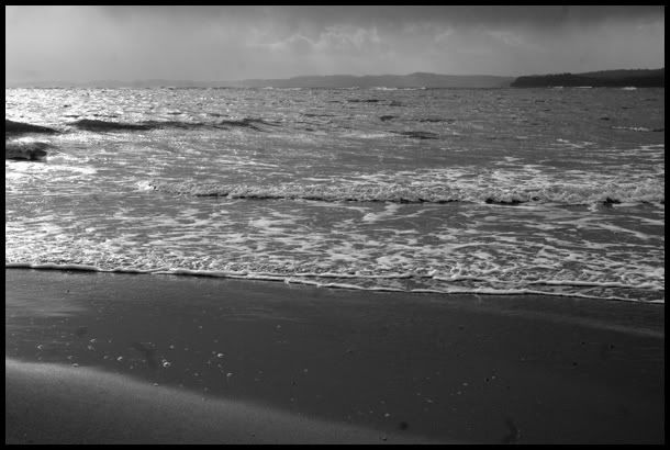
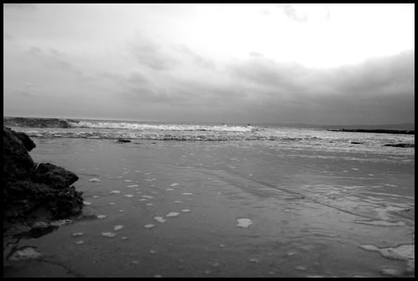
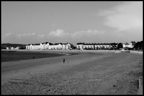
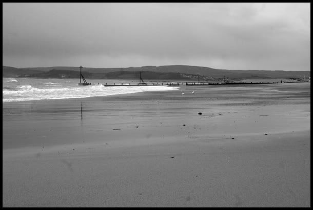
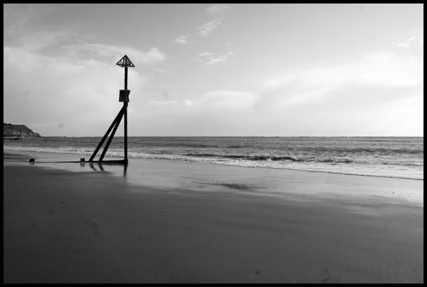
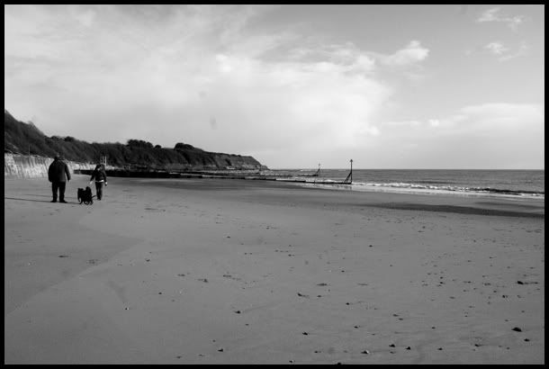
 Exmouth pics 08/02 Exmouth pics 08/02
10 new images. Again, I'm quite pleased with these. Critique welcome as always. Ta.
1.
2.
3.
4.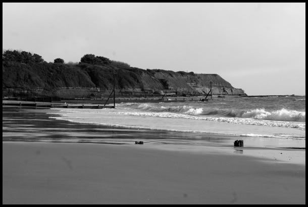
5.
6.
7.
8.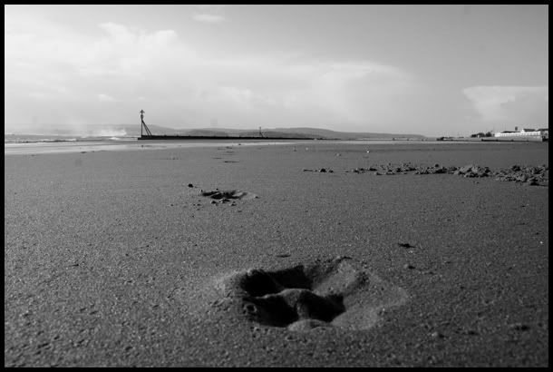
9.
10.
Last edited by neogfx; 02-08-2007 at 08:51 PM.
-
I can't even look at these photos without my eyes moving over to the text. Plz change it XD
-
Redone without the text. I'm not sure why the first is coming up as a link.
-
i like 8 and 9, the others are nice, but i think they could use some cropping to help the composition a bit.
most of them also seem pretty bland and low contrast, although it can be tricky to get much contrast from sand, overall nice work, kep it up :-)
.

-
like em mate, gj. but i would give em a fatter frame, just a simple big fat black frame, i think it would improve the pics more. but you know, dont listen to me XD
number 9 is my fav the contrast between the sea and the rock is awsome,and the sky to love it, its perfect!
-
Cheers for the comments. Anybody else?
-
Get a tripod, a strong ND filter and try taking long exposures when the sun is setting. The water would turn out much better than on these. I would also try to duotone these images. Yellow highlights and blue shadows.
Check out http://denisolivier.deviantart.com and http://correiae.deviantart.com/ for some examples of the style you should look into. 
Similar Threads
-
By neogfx in forum Digital Art
Replies: 6
Last Post: 02-07-2007, 08:30 PM
-
By junaid123 in forum Digital Art
Replies: 1
Last Post: 02-05-2007, 04:36 PM
-
By Horus in forum Digital Art
Replies: 13
Last Post: 10-31-2006, 09:59 PM
 Posting Permissions
- You may not post new threads
- You may not post replies
- You may not post attachments
- You may not edit your posts
-
Forum Rules
|


 Reply With Quote


