0 members and 10,183 guests
No Members online

» Site Navigation

» Stats
Members: 35,442
Threads: 103,075
Posts: 826,688
Top Poster: cc.RadillacVIII (7,429)
|
-
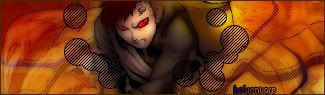
 Gilbert Arenas!!! Gilbert Arenas!!!
Havent posted mine in a while, so instead of posting all of them, ill just post my very latest (Fresh off the photoshop)
C+C:

Remember im still a new designer, so any begginer comments and crits help.
-
could do better
MAYBE
but kinda good for a starter
i remember when i was like that
(a flash back of me as a little baby BANGING ON THE COMPUTER)
but good....render is kinda blurry
-
i like it. the border looks good, text is ok and maybe a bit of blending andit'd look even better. GJ
-
l disagree l dont like the border although l do like that colorful line that flies through the sig also dont blend the render that much maybe gaussian blur it anywhere from 2.0-4.0 and set to soft light itll look quite nice.GJ dude =)
-
ehh, the borders ok. im not a fan but i dont hate it either. i do think in the long run it'll take away from your work. kid of atracts your eye mroe than your eye to teh render. text is good i agree the render is a bit blurry and it would have been cool for you to have added a ligth efect to your render (most likely coming from the right since there is a lot of light there.). but the fonts good and bg goes wellw ith the render. jus keep at it and youll get betetr and better everyday.
 My DevART
RATCHET is my bitch
Andrew says:
u ever stolen a bible?
Apathy says:
no
used the last two pages to roll a joint though
Andrew says:
wow
thats fucking hard core
^^HAHAHA, dm sucks XD
-
we would know wouldnt we Andrew :P
-
I like the idea of the light on the right and how you used it to put text along. I dont like the border too much, though it was a nice idea. Also blending the render a bit would help make it look good. Good job though.
-
-
It is ok, render is a little choppy, the border is ok, and the text is ok.
------------
 C4D Render by Sobe, Planetrenders.com
------------
-
just go around the edges of Arenas with a small soft eraser. I like this one alot, especially how those lines look. The text flows with the sig too. GJ bro
XBOX Live Gamertag: Merc 106

 Posting Permissions
- You may not post new threads
- You may not post replies
- You may not post attachments
- You may not edit your posts
-
Forum Rules
|


 Reply With Quote