0 members and 15,748 guests
No Members online

» Site Navigation

» Stats
Members: 35,442
Threads: 103,075
Posts: 826,688
Top Poster: cc.RadillacVIII (7,429)
|
-
 Work in progress Work in progress
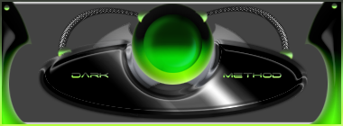
Still lots to do with it. I went with the same colours since I like 'em.
Thoughts or advice?
 Thanks.
Prick.
-
What you have there is really kick ass. Colors match great, reminds me of xbox because of the black n green. It seems to be a little blank though.
XBOX Live Gamertag: Merc 106

-
Thanks. It's only the first version though.
Thanks.
Prick.
-
Think about colour, desaturate shadows, and desaturate light areas. Midtones are saturated irl.
Extreme black and white should also be used a little more sparingly as you rarely encounter them
Layout is ok. Although a little central/mirrored for me =)
-
Looks like my Okama Game Shpere lol i Like it man you definatley got the hang of these types now.
-
Dale, I'm not understanding. What do you mean by desaturating shadows, and desaturatng light areas?
Thanks.
Prick.
-
that looks totally awesome. though it appears to be a bit blank. though looking good so far m8.
-
 Originally Posted by Dark Method

Still lots to do with it. I went with the same colours since I like 'em.
Thoughts or advice?
It's very nice...I like the text and the colors...they all match. Just that it's empty in the back...add things to it.
-
dale said it. saturation is amount of color basically, and the lights and darks are oversaturated now. go to the color picker; the colors on the far right in the box are fully saturated (hence why S changes to 100% and the far left fully desatured. basically, you want to avoid using those colors on the far right for darks and lights (midtones don't go too far right either) because it looks unrealistic. in terms of saturation it's usually midtones > shadows > highlights. usually. and the far left fully desatured. basically, you want to avoid using those colors on the far right for darks and lights (midtones don't go too far right either) because it looks unrealistic. in terms of saturation it's usually midtones > shadows > highlights. usually.
and I agree about the extreme black and white, which should be self explanatory. set up one light source and go with it. right now it looks like you have two or three light sources, which doesn't have to be bad, but try a single consistent light source and it'd look better. if that's a bevel on the background layer, it looks awkward. and what I'm assuming is satin on the middle circle also doesn't look too good. layer styles are limiting in what they allow, and if they're distinguishable they look worse. try other techniques, new layer with large soft brushes, gradients, pen tool, ect.
-
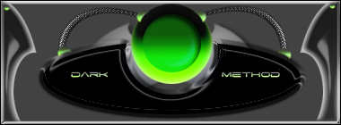
Did a bit of work on it, not much.
Thanks.
Prick.
Similar Threads
-
By rabies =0 in forum Digital Art
Replies: 5
Last Post: 04-10-2006, 02:30 AM
-
By Dale in forum Digital Art
Replies: 5
Last Post: 03-31-2006, 04:46 PM
-
By Shamino in forum Sigs & Manips
Replies: 2
Last Post: 01-01-2006, 11:16 AM
-
By DragonsRage in forum Sigs & Manips
Replies: 6
Last Post: 06-01-2005, 11:53 AM
 Posting Permissions
- You may not post new threads
- You may not post replies
- You may not post attachments
- You may not edit your posts
-
Forum Rules
|


 Reply With Quote


