0 members and 4,351 guests
No Members online

» Site Navigation

» Stats
Members: 35,442
Threads: 103,075
Posts: 826,688
Top Poster: cc.RadillacVIII (7,429)
|
-
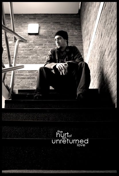
 the hurt of an unreturned love the hurt of an unreturned love
Comments please.
-
The text is nice but it detracts from the image, i find myself looking at that, not the actual photo. Too much in the title imo, also.
This would make a wicked self portrait, nice view.. And i like the lighting 
-
Good shit! But I agree, the text could be a little bit more discreet. Maybe you don't even need it. I would let the portrait talk for itself, but that's me.
-
nice shot mate, i like it. maybe make a little darker on the upper corners and the text is already discoussed ^^
-
 Originally Posted by Dale

The text is nice but it detracts from the image, i find myself looking at that, not the actual photo. Too much in the title imo, also.
This would make a wicked self portrait, nice view.. And i like the lighting
Okay the text works.. but only structurally.. see the text balances out that big white block that is, "the light". Take away the text and it still wouldn't seem just right.. so i'd suggest removing the lamp. You know how to use the clone stamp right? if not here; http://www.good-tutorials.com/ go here.
Then once that's done when you take away the text it won't be so weird. The photo is good, if you do what i say though it still isn't my kind of thing, it's good but it's not to my liking.
deaz\dxloa\dxedr

-
Similar Threads
-
By VooDooRex in forum Sigs & Manips
Replies: 3
Last Post: 01-28-2007, 08:35 PM
-
By Samuel in forum The Void
Replies: 9
Last Post: 02-24-2006, 04:02 PM
-
By Deadloader in forum Digital Art
Replies: 23
Last Post: 11-10-2005, 09:44 AM
-
By Samuel in forum Digital Art
Replies: 3
Last Post: 10-06-2005, 09:31 PM
-
By silvercrap in forum Digital Art
Replies: 6
Last Post: 10-06-2005, 10:10 AM
 Posting Permissions
- You may not post new threads
- You may not post replies
- You may not post attachments
- You may not edit your posts
-
Forum Rules
|


 Reply With Quote


