0 members and 1,845 guests
No Members online

» Site Navigation

» Stats
Members: 35,442
Threads: 103,075
Posts: 826,688
Top Poster: cc.RadillacVIII (7,429)
|
-
 Half Life 2 sig comment+rate Half Life 2 sig comment+rate
Here is my fourth sig with two outcome ready to be jugded and critizided (wrong spelled?) but leave a comment thx. i Present:
Half life2
First one without pattern
Second with pattern
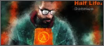 Vs Vs 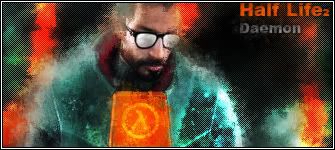
__________________________________________________ __________________________________________________ _____________
_______Life With A Smile______
Last edited by Daemon; 03-19-2007 at 04:58 PM.
-

the lighting is off. put that light source layer at the bottom right instead of the top left, because that's where the highlights on the stock are. it'll look a lot better after that.
-
Text...is it just me or is the "Brother" smaller than "In Arms". Text needs to be fixed. Maybe slide the "In Arms" closer to the right side of the sig.
-
You probably want "brother" bigger than "in arms", so that it equals out, and because it's more important in that expression. Furthermore, I would recommend changing the font - you probably want a faded/splattered font (DaFont - 1942 Report), to match the mood and time. I'd make it slightly smaller, and work on the lighting (the white blob in the second is...well...a blob).
As a last comment: I don't really like the pixellated shader thing you have going on in your sig, but that's just me, I take it.
-konfusion
Last edited by konfusion; 03-17-2007 at 08:28 PM.
-
Thx all
the white blob in the second is...well...a blob
it was also just made on 5 sec the light, course prg thought it was a good idea hehe
Last edited by Daemon; 03-17-2007 at 08:55 PM.
-
lol well having a light source is a good idea. out a the two i liek teh half life one better. the bg is better, and not as dark. I would probobly lower the pattern's opactiy on it a bit tho.
 My DevART
RATCHET is my bitch
Andrew says:
u ever stolen a bible?
Apathy says:
no
used the last two pages to roll a joint though
Andrew says:
wow
thats fucking hard core
^^HAHAHA, dm sucks XD
-
I don't like the pattern or the font. Improve the font (I even posted a link to a good font...), and take away that pattern, and it'll look much better ^^
-konfusion
-
I don't think you need a pattern on it.
XBOX Live Gamertag: Merc 106

-
The effect is crap, the pattern makes my eyes bleed, are you trying to make the glasses stand out? cause that's what you've done and if you intended to that then I'd have to say : well done, you made him look like a big nerd. Not that there's anything wrong with nerds but still though. 2/10.
-
i like it! the colors look very good. jsut add lighting and it´s VERY good to me.
current:

fav:

Similar Threads
-
By Daemon in forum Sigs & Manips
Replies: 7
Last Post: 03-13-2007, 05:08 AM
-
By Xelis in forum Sigs & Manips
Replies: 16
Last Post: 03-13-2007, 02:42 AM
-
By Mohammed in forum Digital Art
Replies: 11
Last Post: 05-26-2005, 08:27 AM
-
By Illegalx17 in forum Sigs & Manips
Replies: 4
Last Post: 03-10-2005, 12:14 AM
 Posting Permissions
- You may not post new threads
- You may not post replies
- You may not post attachments
- You may not edit your posts
-
Forum Rules
|


 Reply With Quote


