0 members and 16,871 guests
No Members online

» Site Navigation

» Stats

Members: 35,442
Threads: 103,075
Posts: 826,688
Top Poster: cc.RadillacVIII (7,429)
|
-
 new here new here
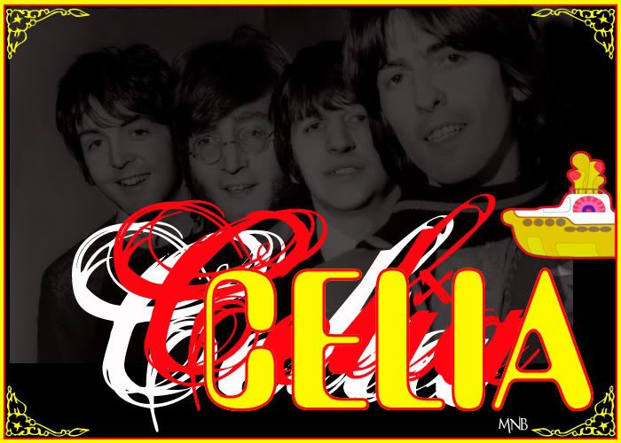
im still kinda new with ps. but whatcha think.


Last edited by RONIN; 03-22-2007 at 09:24 PM.
-

i cant see it :|
could you try re-hosting it?
-
-

somtimes i like the text to be the focal point, but thanx for the advice.
heres somemore.


-

i actually LOVE your style. i dig the vivid colors and your liquify work is wonderful without being overpowering. that fish trips me out!
honestly, i dont think there's anything wrong with the text being the focal point. thats the roots of the signature. its a visual representation of you and seeing as how no one knows you by anthing other than the name you provide...i think it makes perfect sense. all the sigs i made when i started f-ing around with photoshop were just that...different and creative ways of using my name. kudos. great work.
p.s. not digging the 007 one too much though.
-

lol , thank you very much, that means alot to me, and it keeps me motivated, so again, thank you. i actually make the text the focal point in most of my work cuz most of my work is for someone asking me to make them a sig, and if they dont have an idea of what they want, i just go by their name, and try to make something that represents their name as close as i can. (and the 007 one was near the begining of my ps experience, lol but i thought it was kinda cool.)
Last edited by RONIN; 03-23-2007 at 04:40 PM.
-


heres another one i did. no i made the text to be a little bit of the focal point, only cause i wanted it to be comic book like.
-

I like some of the concepts. Just try to make the text smaller, and keep working at it. I'm sure you'll improve .D
-konfusion
 Posting Permissions
- You may not post new threads
- You may not post replies
- You may not post attachments
- You may not edit your posts
-
Forum Rules
|


