0 members and 674 guests
No Members online

» Site Navigation

» Stats
Members: 35,442
Threads: 103,075
Posts: 826,688
Top Poster: cc.RadillacVIII (7,429)
|
-
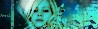
 Avril Lavigne sig Avril Lavigne sig
dunno what to write so just saying C&C 
-
This sig is one of your best. The bg is good and teh render blends in pretty well. The text isn't terrible either. I only have one small complaint with this and that is that the lines are distracting. They only go half way to the top of the sig and it annoys me. But this is a good sig.
 My DevART
RATCHET is my bitch
Andrew says:
u ever stolen a bible?
Apathy says:
no
used the last two pages to roll a joint though
Andrew says:
wow
thats fucking hard core
^^HAHAHA, dm sucks XD
-
nice sig! i would like to see more of her true hair color. maybe removing the green/blue softly form her hair and face would increase depth.
current:

fav:

-
Hmm I love what you've done with it but I think that blue's completely killed it. There's no variation in colour now, try erasing/brushing over some of the parts.
~ Latest ~
 ~
~ Favourite ~

-
Perhaps lighten her face a bit and make it less monotonous - your best sig so far.
-konfusion
-
thx i might try that but its kinda hard to get her face coulor back without destroying somthing else!
-
it's 2 blue 4 me=/ I don't like the "Arvil" text and add some more clipping masks on the right side or try maybe make it similar 2 the left(darker and not so much liquid kinda think)... just few tips, it's a good sig so gj^^
-
I like it> although i'm not too sure on the colour scheme. Looks pretty good though
Similar Threads
-
By sceptileex in forum The Void
Replies: 5
Last Post: 07-04-2005, 11:55 PM
 Posting Permissions
- You may not post new threads
- You may not post replies
- You may not post attachments
- You may not edit your posts
-
Forum Rules
|


 Reply With Quote


