0 members and 660 guests
No Members online

» Site Navigation

» Stats

Members: 35,442
Threads: 103,075
Posts: 826,688
Top Poster: cc.RadillacVIII (7,429)
|
-
-

lesee now...here we go...
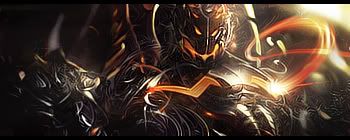
1st sig: has the most potential of all of em. Especially if you move Heihachi to the left some, slightly offcenter. Also, he needs some blending. And maybe an effect or 2 to the bg. But I like it mostly.
2nd sig: She definitely needs some work done. Theres a white pixely outline around her that needs going away. And same as above, some blending. And since the bg is basically just her again, it needs something else done to it to hide the fact.
3rd sig: same as before, bring on teh blending of the renders lol. But not bad.
4th sig: see above comments about blending, and bg work.
Hope you saved the psd files.
-

If i had to choose one, it would be the first. I like the text on the second but it's too simple. The third is AAAAAHHHH!!! And the fourth is like the second, way too simple.
Fave:
~~-Gift from a friend-~~
-
-
Similar Threads
-
By mAtAnDoTe in forum Resources
Replies: 1
Last Post: 10-05-2006, 07:48 PM
-
By Chaka Zulu in forum Sigs & Manips
Replies: 3
Last Post: 03-08-2005, 08:48 PM
-
By graffic in forum Sigs & Manips
Replies: 5
Last Post: 02-02-2005, 09:15 PM
 Posting Permissions
- You may not post new threads
- You may not post replies
- You may not post attachments
- You may not edit your posts
-
Forum Rules
|
. this is what i got. The hue was added last minute because i felt it'd look better and it does.


 Reply With Quote


![[PHXN] New001's Avatar](image.php?u=7015&dateline=1264038258)
![Send a message via Yahoo to [PHXN] New001](http://www.gfxvoid.com/forums/images/misc/im_yahoo.gif)
