0 members and 14,880 guests
No Members online

» Site Navigation

» Stats
Members: 35,442
Threads: 103,075
Posts: 826,688
Top Poster: cc.RadillacVIII (7,429)
|
-
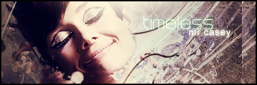
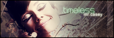
 Timeless Timeless
I've sorta been in a rut lately where I can't make anything I really like, and I've been in photoshop a lot just messing around seeing if I can get myself out of that. I came up with this and I kind of like it.
v1
v2
v3. I thought I'd do another version. Is this any better?

Last edited by Rhage; 04-12-2007 at 01:17 AM.
Reason: Added new
-
Oh wow, so much you could improve on but so much you got right:
v1: background = great, stock = overly contrasted and brightened, text = the green is really out of place, take a colour from the stock and move it around a bit
v2: ok, the background just looks rubbish tbh, i get the feeling you only did that so the text would stand out more?
~ Latest ~
 ~
~ Favourite ~

-
^ agreed exactly, plus that duplicate on the right is pointless. doesn't work for this
v1 for sure, but v2 has more potential.
-
Hmmm
I made some changes to both...


-
Did another version.
-
Why was my topic moved to Signature Tutorials?
-
i think the green text rocked. v3 is ok, but the blur and the scanlines are obsolete.
current:

fav:

-
 Posting Permissions
- You may not post new threads
- You may not post replies
- You may not post attachments
- You may not edit your posts
-
Forum Rules
|


 Reply With Quote

![[PHXN] New001's Avatar](image.php?u=7015&dateline=1264038258)
![Send a message via AIM to [PHXN] New001](http://www.gfxvoid.com/forums/images/misc/im_aim.gif)
![Send a message via Yahoo to [PHXN] New001](http://www.gfxvoid.com/forums/images/misc/im_yahoo.gif)
