0 members and 673 guests
No Members online

» Site Navigation

» Stats
Members: 35,442
Threads: 103,075
Posts: 826,688
Top Poster: cc.RadillacVIII (7,429)
|
-
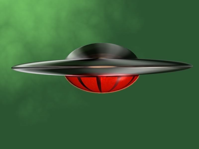
 Flying Saucer Flying Saucer
the intention of this was to make it look like the flying saucer from The Forbidden Planet, so tell me what you think.
-
Cool spaceship, wtf? background.
-
it was just some random background to put it against, other than that is serves no purpose.
-
The space ship is ok. It could be a bit more complex looking. No doubt it looks liek a flying saucer but, id like to see more it doesnt jump out at me and make me go whoa. Also its a bit pixelated on the top half cirle around teh edges. another thing is IMo i think itd look way better on a dark red/black gradient rather than green.
 My DevART
RATCHET is my bitch
Andrew says:
u ever stolen a bible?
Apathy says:
no
used the last two pages to roll a joint though
Andrew says:
wow
thats fucking hard core
^^HAHAHA, dm sucks XD
-
wow
i love the reflections on the metal (ship)
overall its good, but the thing that will certainly take it from good to brilliant is a suitable background. and maybe have it reflect slightly off the ship
but appart from that, leave the ship alone
-
The top art doesn't really look right, the lighting that is. And the red is a bit bright XD hah.
But it looks good, the metal looks real decent (Y)
-
Y'all forgetting it was supposed to be my recreation of Jupiter from The Forbidden Planet. The reason it is not more complex than it currently is, is because the orginal was not complex itself. Google the orginal and look at mine and you'll see what I was aiming for. And again, the background was just randomly applied, XD
-
the ship has nice lighting. make the background actually fit and cause that lighting.
-
I only figured it was a ship after reading some of the comments, since i didn't know what "saucer" means :P
You should probably do this in a 3d program instead of photoshop if you were to use this for something ^^ ............ I don't really like it, doesn't look that good to me.
Similar Threads
-
By Virulent in forum Digital Art
Replies: 4
Last Post: 02-23-2006, 01:48 PM
-
By HeadShot in forum Sigs & Manips
Replies: 9
Last Post: 06-16-2005, 02:40 PM
 Posting Permissions
- You may not post new threads
- You may not post replies
- You may not post attachments
- You may not edit your posts
-
Forum Rules
|


 If You're not A Filter-Monkey, Copy this into your sig!
 Reply With Quote


