0 members and 673 guests
No Members online

» Site Navigation

» Stats
Members: 35,442
Threads: 103,075
Posts: 826,688
Top Poster: cc.RadillacVIII (7,429)
|
-
-

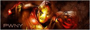
Very nais adam. I like the how the bg and render match.
-
-
Really simple, nothing too special about it. Not too much of a bg, just some grunge brushes it looks like. Text looks strange though, seems jagged.
Fave:
~~-Gift from a friend-~~
-
shane does it again hehe say my thoughts again and again i agree with him
-
:O
I'm a mind reader... I just noticed something I do like though, the bright spots on the render, I'm not sure if you made those or not...
Fave:
~~-Gift from a friend-~~
-
-
I agree with the text being jagged, a little big too
-
It's great that you're paying attention to light sources! I'd say lower the opacity of whatever text you see fit so it doesn't stand out too much against the darker background. =D
Similar Threads
-
By LoganGFX in forum Sigs & Manips
Replies: 4
Last Post: 03-29-2007, 08:18 PM
-
By Flip in forum Sigs & Manips
Replies: 4
Last Post: 06-10-2006, 07:52 PM
-
By Dutch-Soldier(nl) in forum Digital Art
Replies: 4
Last Post: 10-08-2005, 11:47 PM
-
By Arkanian in forum Sigs & Manips
Replies: 2
Last Post: 07-28-2005, 09:23 PM
-
By 2-intenze in forum Sigs & Manips
Replies: 5
Last Post: 03-05-2005, 01:49 PM
 Posting Permissions
- You may not post new threads
- You may not post replies
- You may not post attachments
- You may not edit your posts
-
Forum Rules
|


 Reply With Quote