0 members and 757 guests
No Members online

» Site Navigation

» Stats
Members: 35,442
Threads: 103,075
Posts: 826,688
Top Poster: cc.RadillacVIII (7,429)
|
-

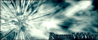
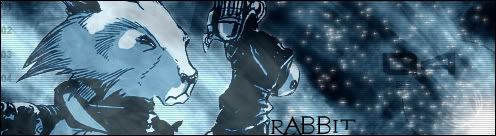
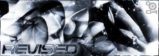
Ill Go From Oldest To Newest.....
1. - 
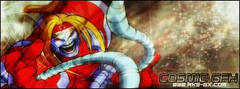
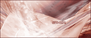
2. - 
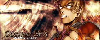
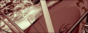
3. - 
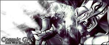
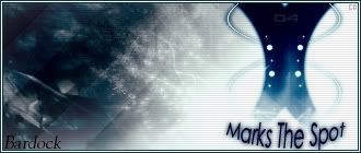
4. -
5. - 
-
6. - 
7. - 
8. - 
9. - 
~~~~~~~~~~~~----Oldy----~~~~~~~~~~~~~
10. - 
-
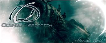
I like them, but my favourites is 3,4,6 & 7
3rd: color looks great, so does the render. It really fits and the bg has a cool effect, still, it maybe would have looked cool with some abstract brushing there. nice job on the text too.
4th: It's just so cool, color is clean and neat, render fits well to the cool bg, nothing to complain about really, maybe a litle too white in some parts.
6th: Like the color, and the whole sig has a very cool look. On thing, the animated glow that goes on the right part pops up and starts somewhere else, doesn't look that good, and try to make them fade a little bit.
7th: I don't really know what to say, I just like it. The style is cool and so is the colors. good job
I like your style and most of your work, you have a great selection of colors too ^-^ Keep it up mate, and great job.
-
3 and 9 look pretty awesome...
-
TY....jerner ty for the indepth feed....ill look at ur work...ty to both of u for the reply
-
i like 1, 3 & 6 the most  nice job nice job
overall rating: (7.9/10)
-
6 & 8 are awsome
6 always makes me laugh because i'm hoping that some drunken(or stumbling) star might get off the path and hit another one. and then this one's wondering around on your sig ^_^
-
-
Yeap 6 is fantastic mate. love the suttle animation u got going on.
-
 Posting Permissions
- You may not post new threads
- You may not post replies
- You may not post attachments
- You may not edit your posts
-
Forum Rules
|


 Reply With Quote

