GFXVoid Graphic Design Forum

Remove Text Formatting
Loading...

» Online Users: 3,964

0 members and 3,964 guests
No Members online

» Site Navigation

 > FAQ

» Stats

Members: 35,442
Threads: 103,075
Posts: 826,688
Top Poster: cc.RadillacVIII (7,429)
Welcome to our newest member, Lekelindids
Results 1 to 4 of 4
  1. #1
    Join Date
    Apr 2007
    Posts
    9

    Arrow Here's My Most Recent


  2. #2
    Join Date
    Mar 2007
    Location
    Denmark
    Posts
    4,197

    Default

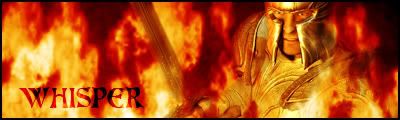
    need lots of work. the bg dont look so much like flames (hope thats what they are supposed to?) the text dont fit with the bg looks like you have put it on overlay? keep up


  3. #3
    Join Date
    Mar 2007
    Location
    MA of the US
    Posts
    354

    Default

    I agree that the flames are unrealistic... maybe they're just too thick. The font is kinda weird... and oddly placed. Border is real thick too.
    Fave:

    ~~-Gift from a friend-~~

  4. #4

    Default

    agreeing with Daemon, needs a lot more work. Try to also work on the text.

Similar Threads

  1. Here's My Most Recent
    By whisper in forum Sigs & Manips
    Replies: 3
    Last Post: 04-18-2007, 02:41 PM
  2. Some Recent Work
    By Jack in forum Digital Art
    Replies: 12
    Last Post: 11-03-2006, 02:20 AM
  3. My most recent sig.
    By Frozen in forum Sigs & Manips
    Replies: 2
    Last Post: 08-28-2006, 01:37 AM
  4. Recent sigs
    By GoldenSun in forum Sigs & Manips
    Replies: 10
    Last Post: 04-08-2006, 02:18 PM
  5. Recent work
    By McStarken in forum Sigs & Manips
    Replies: 6
    Last Post: 12-27-2005, 03:01 PM

Posting Permissions

  • You may not post new threads
  • You may not post replies
  • You may not post attachments
  • You may not edit your posts
  •  
Powered by vBadvanced CMPS v4.1.1