0 members and 674 guests
No Members online

» Site Navigation

» Stats
Members: 35,442
Threads: 103,075
Posts: 826,688
Top Poster: cc.RadillacVIII (7,429)
|
-
-

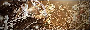
Rofl its not even close. This is the best sig from you i've seen, but for some reason the text is still jagged..
Fave:
~~-Gift from a friend-~~
-
-
Interesting effects, the lighting is done well. The text could be better.
-
No no, not an insult. I mean to say that it's much better than anything i've ever seen you do.
Fave:
~~-Gift from a friend-~~
-
Text needs improvement - use an Arial style font (formal)
Make it nice and small, and possibly white. I'd put it in the center of the right part of your sig .D
-konfusion
-
 Originally Posted by Shane

No no, not an insult. I mean to say that it's much better than anything i've ever seen you do.
Well thank you Shane!
Thats literally the nicest thing I've ever heard you say.
Favorite:
Latest:
-
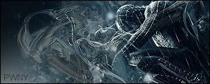
The render is way to distorted, it's hard to tell what it is, and to focus on it. That wave effect seems a bit out of place, maybe if you rotated it and moved it closer to the render it'd fit better.
Good lighting, but the text needs to be changed.
All that stuff about the render being distorted goes to waste if it was supposed to be abstract, cause if it was it looks wicked!
-
-

Take my advice damn you! :P
-konfusion
 Posting Permissions
- You may not post new threads
- You may not post replies
- You may not post attachments
- You may not edit your posts
-
Forum Rules
|


 Reply With Quote


