0 members and 6,879 guests
No Members online

» Site Navigation

» Stats
Members: 35,442
Threads: 103,075
Posts: 826,688
Top Poster: cc.RadillacVIII (7,429)
|
-
 new sig new sig
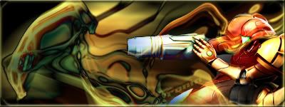
c&c please, i made this bg and it came out pretty cool.
-
The render is blended pretty well, but the colors of the effects could match better, and could be better in general. Looks like just wave/liquify at random.
-
I'd work on the coloring - and make the wave more symmetrical, so it looks more intended.
-konfusion
-
actually, the effect was done by first creating a design with the brush tool, then distort wave, then fade, and distort again, then outer glow, then duplicate, then color, then set the duplicate to screen, and distort wave the duplicate, then offset it to the left, then merged them together, then used the dogde tool, to highlight some areas, then duplicate again, then put a motion blur on that duplicate, then set that layer to difference. and i think its a nice transition of color from the right to left, or even left to right. its just yellow, orange, red orange, red and green. and thats the colors that are in the render.
Last edited by RONIN; 04-29-2007 at 05:58 AM.
-
cba to read all that, but don't try to defend yourself when people give you critique
-
i will defend when someone implies that i didnt do anything but wave/liquify (randomly).
Last edited by RONIN; 04-29-2007 at 02:42 PM.
-
Big fan of Samus sounds like alot of work went into it good job. i did a BW of almost the same pic turned out really good
-
Good text! i liek how it blends with the sig i really liek the text.
 My DevART
RATCHET is my bitch
Andrew says:
u ever stolen a bible?
Apathy says:
no
used the last two pages to roll a joint though
Andrew says:
wow
thats fucking hard core
^^HAHAHA, dm sucks XD
-
 Originally Posted by RONIN

i will defend when someone implies that i didnt do anything but wave/liquify (randomly).
that's what it looks like, so it doesn't look good because of that. doesn't matter if you put a lot of work into something if it doesn't look good.
for the sig, it's too flat with a kind of weak focal point. add some lighting too. text doesn't fit either since the flow isn't in that direction. and well, there's no flow at all really, because the bg is too random. try to get it to go in one direction instead of all over the place to get that flow. I'd suggest liquify or smudge for that.
-
 Posting Permissions
- You may not post new threads
- You may not post replies
- You may not post attachments
- You may not edit your posts
-
Forum Rules
|


 Reply With Quote


