0 members and 853 guests
No Members online

» Site Navigation
» Stats
Members: 35,442
Threads: 103,075
Posts: 826,688
Top Poster: cc.RadillacVIII (7,429)
|
-
Bak
Been long time, idk if anyone i know is still around here.


-
Great text placement, and lighting. Over all I'm liking your style.
First one seems a little empty on the right side.
-
I think I remember you actually.
I like the style, but they all seem a bit empty to me, especially the first one.
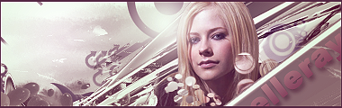
Your Avril sig's great, although again, it seems a bit empty, but it's by far the best of the three. Text in it looks good and fits, and I think you chose a right combination of brushes in it. I have the same ones myself. Work on the left side a touch and I think it'd be a kick ass sig.
Thanks.
Prick.
-
Love em all... especially the second. Such great depth.
Fave:
~~-Gift from a friend-~~
-
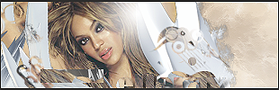
1st one looks kind of cluttered imo, and empty on the right side. I can't read the text on it.
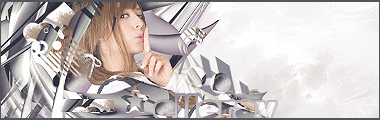
2nd one has great depth, but it's empty on the left.
I like the third 
-konfusion
-
I was going to say something, but then I realized it's the same exact thing that Shane said. xP So ditto on that.
Posting Permissions
- You may not post new threads
- You may not post replies
- You may not post attachments
- You may not edit your posts
-
Forum Rules
|