0 members and 17,241 guests
No Members online

» Site Navigation

» Stats
Members: 35,442
Threads: 103,075
Posts: 826,688
Top Poster: cc.RadillacVIII (7,429)
|
-
-

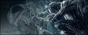
I'm diggin it. But as a usual for you the text is rough...
Fave:
~~-Gift from a friend-~~
-
-
 Originally Posted by Shane

I'm diggin it. But as a usual for you the text is rough...
I don't mean to be ignorant, but could you please give me step by step instructions on how to make it not jagged?
Favorite:
Latest:
-
-
^ Agreed. Maybe try new fonts too..
Fave:
~~-Gift from a friend-~~
-
Eh - mess around with text effects like "Smooth" and "Crisp" - or just but a blur over it.
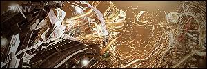
I like it, but the wind is way too much imo...
-konfusion
-
I agree the wind effect looks nice but it kinda overule the sig, turn it down a little and it would look better.
-
Originally Posted by [PHXN] New001
Filter-blur-anything will pretty much make it softer
yea also toning down the opacity works kinda well too.
 My DevART
RATCHET is my bitch
Andrew says:
u ever stolen a bible?
Apathy says:
no
used the last two pages to roll a joint though
Andrew says:
wow
thats fucking hard core
^^HAHAHA, dm sucks XD
-
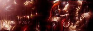
i like the lighting effect you put in the top left corner its a very rugged peice. depending on what you where going for i would say it looks good as a rough sig.
Similar Threads
-
By Xander in forum Sigs & Manips
Replies: 6
Last Post: 10-16-2006, 06:13 PM
-
By Kritacul in forum Sigs & Manips
Replies: 8
Last Post: 12-15-2005, 08:28 PM
-
By Umbee in forum Sigs & Manips
Replies: 3
Last Post: 10-09-2005, 10:52 PM
-
By HeadShot in forum Sigs & Manips
Replies: 2
Last Post: 04-25-2005, 12:36 PM
-
By ghetto fab in forum Sigs & Manips
Replies: 6
Last Post: 02-26-2005, 02:31 PM
 Posting Permissions
- You may not post new threads
- You may not post replies
- You may not post attachments
- You may not edit your posts
-
Forum Rules
|


 Reply With Quote


![[PHXN] New001's Avatar](image.php?u=7015&dateline=1264038258)
![Send a message via Yahoo to [PHXN] New001](http://www.gfxvoid.com/forums/images/misc/im_yahoo.gif)


