0 members and 26,370 guests
No Members online

» Site Navigation

» Stats
Members: 35,442
Threads: 103,075
Posts: 826,688
Top Poster: cc.RadillacVIII (7,429)
|
-
 a few newer ones a few newer ones
just a couple newer sigs; I cant remember if I posted any of these for cnc or not.
for sotw elsewhere:

just because:

for a battle elsewhere(over and done now):
another just because:

so there ya go.
-
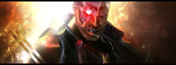
#4 is my fav. the others could use better focus, a little too much blur and not enough sharp for some.
-
-
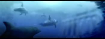
A few are hard to look at and have no focal point. And the sharp one has no focus in it. If you could do one shark with alot of focus/sharpness, it'd look pretty good.
Did you paint the shark one?
-
i dont think they are sharks they are dolphins
-
I like 1 and 4 the most ...especially the first...*fapfapfapfapfapfapfap*
-konfusion
-
Yea they look like dolphins to me. The last one is my fav, but the fourth is real good too. Excellent work on all, you really do have mad talent.
Fave:
~~-Gift from a friend-~~
-
@ dale: theyre dolphins:P. But no,I didnt paint it. Its a mix of like 3 different stock pics, a c4d(or 2 maybe?), and a lot of patience. I found that on underwater 'scene' sigs, that more are meant to be a picture, theyre a pain.
To stay true to the 'underwater' feel, most everything would be blurry(since everything in the sig is further away), even the 'focal' dolphin upfront. I dont see how I couldve done what I intended(which I did) and not had a lot of blurriness. No biggie though; most all of my sigwork is more for fun/challenge. I dont get too bummed out if people dont always think theyre awesome.
Similar Threads
-
By AgainstAllOdds in forum Sigs & Manips
Replies: 3
Last Post: 11-22-2005, 07:07 PM
-
By dbziscool in forum Sigs & Manips
Replies: 5
Last Post: 09-22-2005, 01:01 AM
-
By Haven in forum Sigs & Manips
Replies: 2
Last Post: 03-27-2005, 03:58 AM
-
By Krimsyn in forum Sigs & Manips
Replies: 4
Last Post: 03-26-2005, 08:55 PM
-
By Krimsyn in forum Sigs & Manips
Replies: 7
Last Post: 03-03-2005, 11:12 AM
 Posting Permissions
- You may not post new threads
- You may not post replies
- You may not post attachments
- You may not edit your posts
-
Forum Rules
|


 Reply With Quote
![[PHXN] New001's Avatar](image.php?u=7015&dateline=1264038258)
![Send a message via AIM to [PHXN] New001](http://www.gfxvoid.com/forums/images/misc/im_aim.gif)
![Send a message via MSN to [PHXN] New001](http://www.gfxvoid.com/forums/images/misc/im_msn.gif)
![Send a message via Yahoo to [PHXN] New001](http://www.gfxvoid.com/forums/images/misc/im_yahoo.gif)


