v1 v2
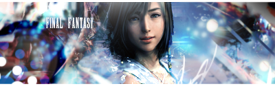
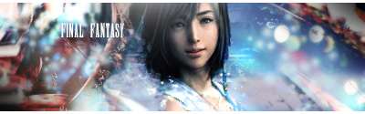
Pretty good, but she looks tiny for some reason, her body may be chopped off. The bg on the left is a little strange and doesn't really look like anything, but it's not a bad piece of work. V1 ftw.
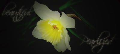
Fave: ~~-Gift from a friend-~~
Both versions look nice, but I agree with Shane, v1 is slightly better. Now I feel like making an FF sig. xD But I think I should do my homework first.
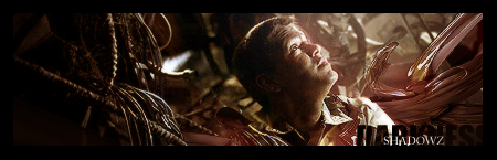
Dead secksay! I love it. Although I'd put your name on it to avoid ripping.
yeah it's hot i like em' they look kinda flat to me though for some reason...i like v2 better personally
Throughout life advance daily, becoming more skillfull than yesterday, more skillfull than today...this is neverending...Hagakure
Forum Rules


 Reply With Quote