0 members and 6,176 guests
No Members online

» Site Navigation

» Stats
Members: 35,442
Threads: 103,075
Posts: 826,688
Top Poster: cc.RadillacVIII (7,429)
|
-

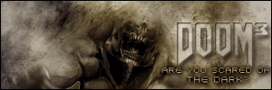
Plz post some feedback. TY in advance.
-
i think it, i think the colors are good for Doom, the text fits in pretty good, i think how the render and background blend really well
8/10
-
not bad. i reallly like the blending on him. it lacks depth tho.
If you want help...
Screw you
If you make sigs...
Screw you
-
i think its a very well put together sig. nothin really fancy just a nice lookin sig, good job. 8/10
-
Great brushing and multi color effect, I love that! The signiture is a tad empty on the left side, move the render a little bit.
-
Originally posted by Illegalx17@Mar 17 2005, 05:05 PM
not bad.* i reallly like the blending on him.* it lacks depth tho.
[snapback]19920[/snapback]
Meaning add another guy or something or what. Can you gave a little detail on that.
-
meh. depth. . .its really hard, i still dont really understand it. its in grunge sigs kinda like you need a kinda strong thing in the back, maybe its just me, idk. like i'll put some scratch brushes in the back and they stay there then some more "sloppy" grunge brushes like what you have. . .its hard to explain. . .
If you want help...
Screw you
If you make sigs...
Screw you
-
Kinda like little script brushes with old parchment type feel? Like what you have in you sig?
-
Nice sig....the blending is real nice....BUT the sub test "Are you scared of the dark?"..that messes it up, take that out and add ur name in a small test with a LITTLE or no glow..
-
Uh..I'll try to explain depth. Well what you have in that sig there is basically a flat image. The more experienced grunge sig designers have the ability to find a balance between the light and the dark to bring everything put into the sig forward to make it look almost detached from the background. So you have to try to make things stand out. It's not necessarily just adding a specific type of brush, but just finding that balance between light and dark. This is usually accomplished by adding many multiples of layers, minimum of 12 layers of brushing with many different blending modes used. I think Crofty might be able to explain it a lot better, he's the one who's always preaching about how the new members have no depth in their signatures.
(By the way, Crofty, that last sentence wasn't an attack at you of any kind ...just couldn't think of better words to use.. I really like your sigs, dude.)
Similar Threads
-
By Tyson in forum Sigs & Manips
Replies: 4
Last Post: 12-09-2005, 04:49 PM
-
By weasel in forum The Void
Replies: 1
Last Post: 11-02-2005, 09:01 PM
-
By Tyson in forum Sigs & Manips
Replies: 3
Last Post: 09-04-2005, 03:55 PM
-
By Link in forum Sigs & Manips
Replies: 6
Last Post: 04-23-2005, 04:38 PM
 Posting Permissions
- You may not post new threads
- You may not post replies
- You may not post attachments
- You may not edit your posts
-
Forum Rules
|


 Reply With Quote

