0 members and 659 guests
No Members online

» Site Navigation

» Stats
Members: 35,442
Threads: 103,075
Posts: 826,688
Top Poster: cc.RadillacVIII (7,429)
|
-
 tank sig tank sig
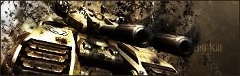
i was lookin at s0ggywaffles tut, liked the render, so i used it on this sig, ended up not using the tut though
-
that looks very very cool. it gets just a little bit too dark near the right edge of the image, cause the shadow from the barrels is very strong. the text could be a little better, and maybe placed a little differently, but i have to say the entire right half is very well done.
-
I would work on your text, it is in a wierd place, and its to big and visible, nice job on the actually sig.
-
 Originally Posted by undertone

that looks very very cool. it gets just a little bit too dark near the right edge of the image, cause the shadow from the barrels is very strong. the text could be a little better, and maybe placed a little differently, but i have to say the entire right half is very well done.
do u mean the left side? the right is what the criticism was about
-
yeah sorry, the left side is fine, the right is where the problems are. my bad.
Similar Threads
-
By DrksYd665 in forum Sigs & Manips
Replies: 17
Last Post: 01-07-2006, 04:56 PM
-
By nightfire_uk in forum Sigs & Manips
Replies: 6
Last Post: 07-10-2005, 05:10 PM
 Posting Permissions
- You may not post new threads
- You may not post replies
- You may not post attachments
- You may not edit your posts
-
Forum Rules
|


 Reply With Quote


