0 members and 6,727 guests
No Members online

» Site Navigation

» Stats
Members: 35,442
Threads: 103,075
Posts: 826,688
Top Poster: cc.RadillacVIII (7,429)
|
-
 My sig called Squirlley My sig called Squirlley
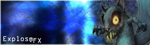
Rate or Hate please 

    ")     
 [((_CRAYOLA_((]>[((_CRAYOLA_((]>[((_CRAYOLA_((]>[((_CRAYOLA_((]>[((_CRAYOLA_((]>[((_CRAYOLA_((]>
-
No Blending.
Terrible Background.
Not so hot text.
Too big.
Results: 2/10
Hate to be harsh.
-
ok, im actually going to tell you how to improve this. the text is too large, try and make it blend more with the image by lowering its opacity, maybe taking its colour from the image your using. the background isnt all that terribel, but it needs allot of work. it feels too filtery, and it just feels very boring. the image you used looks like its got an outer glow around it, not good. try leaving the image at full opacity, with no blending styles and using a low opacity erraser to remove bits around the edges.
-
 Originally Posted by undertone

ok, im actually going to tell you how to improve this. the text is too large, try and make it blend more with the image by lowering its opacity, maybe taking its colour from the image your using. the background isnt all that terribel, but it needs allot of work. it feels too filtery, and it just feels very boring. the image you used looks like its got an outer glow around it, not good. try leaving the image at full opacity, with no blending styles and using a low opacity erraser to remove bits around the edges.
Ill second that.
Also make your canvas a bit smaller and maybe add the render in the center Keep up working?
Similar Threads
-
Replies: 30
Last Post: 12-14-2005, 04:47 PM
 Posting Permissions
- You may not post new threads
- You may not post replies
- You may not post attachments
- You may not edit your posts
-
Forum Rules
|


 Reply With Quote