0 members and 692 guests
No Members online

» Site Navigation

» Stats

Members: 35,442
Threads: 103,075
Posts: 826,688
Top Poster: cc.RadillacVIII (7,429)
|
-
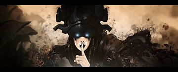
 First real sig, C+C please First real sig, C+C please

This is the first few real sigs i've made myself. Thank you to all the tutorial posters out there, they all helped me a lot to get started  . .
Only thing I have a hard time doing is blending in the text, and for some reason it looks like there is a line going down through the middle of the render. Anyone know any way to fix that?
Suggestions/comments please!
-

well, the line might be from an effect on a layer that ends along that line. i find the whole image your using is hard to see, hard to focus on. the background is a cool effect, its different from what ive seen most of the time. the text is ok, blending text is more of a trial and error process for me then anything so i cant really give you any tips in that department.
-

I agree with undertone, except I don't care for your choice of font.
Latest:

-

Hmm this is actually a good sig, thinkin that its your first nice try. About the blending of the text try just to lower the opacity when its on black GJ keep up practise GJ keep up practise
-

Thanks for the comments, I'm thinking ill try and re-do this with a different render (I found that the actual render had that line through it ><).
Similar Threads
-
By Aaqil in forum Battlegrounds
Replies: 0
Last Post: 05-03-2007, 09:04 AM
-
By CrazyGamer in forum Digital Art
Replies: 8
Last Post: 01-01-2006, 04:59 PM
-
By *Peng* in forum Digital Art
Replies: 3
Last Post: 09-14-2005, 12:34 PM
-
By Runch in forum Support
Replies: 4
Last Post: 06-24-2005, 08:32 AM
-
By Quickdust in forum Sigs & Manips
Replies: 8
Last Post: 06-23-2005, 01:16 PM
 Posting Permissions
- You may not post new threads
- You may not post replies
- You may not post attachments
- You may not edit your posts
-
Forum Rules
|
.


 Reply With Quote


