0 members and 7,652 guests
No Members online

» Site Navigation
» Stats
Members: 35,442
Threads: 103,075
Posts: 826,688
Top Poster: cc.RadillacVIII (7,429)
|
-
Gaara

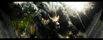
I don't think Naruto was meant to show only confidence and aggression, which most Naruto sigs happen to show a lot.
-
it would be cool... if not for the text... it kills the whole thing >_<

If everyone cared and nobody cried...
If everyone loved and nobody lied...
If everyone shared and swallowed their pride...
Then we'd see the day that nobody died...
noobdesign.net ftw
-
-
gah... not good. Never rush your text, the text is just as important as the background, flow, light source, render placement, etc...
No one element in a sig is the defining thing, it is all of them together that make a great sig. Unfortunately that includes the text as well.

If everyone cared and nobody cried...
If everyone loved and nobody lied...
If everyone shared and swallowed their pride...
Then we'd see the day that nobody died...
noobdesign.net ftw
-
I guess it's time to take a trip to dafont again. :/
-
hehe, a new font doesn't always fix a problem with text, that largest problem I found is blending the text with the rest of the sig. If possible place your text early and continue to place elements on top of it, just like you would your render (I do anyway) however it's pretty hard to put the text in at an early stage like that.
When it comes to font choice, the simpler the better usually. Good text lies in the arrangements, placement, and aforementioned blending.
The easiest way I found to blend your text is to throw it on there at the end, but then hide the layer it is on. Then ctrl+shft+alt+e to stamp visible on a new layer. Then unhide your text layer and start erasing (usually with a grungy brush) your stamped layer above it. This will uncover bits and pieces of the text, and should give you something kinda cool looking. After that play around with your layer style for the text layer and enjoy ^_^
That's how I do it anyway... you should experiment to find what works best for you, 'cause not everyone should do the same thing, that would be boring >_<

If everyone cared and nobody cried...
If everyone loved and nobody lied...
If everyone shared and swallowed their pride...
Then we'd see the day that nobody died...
noobdesign.net ftw
-
I only use default brushes.
Edit: I don't have any fonts themed for this.
Last edited by killaziller; 06-30-2007 at 02:19 AM.
Reason: Adding some thoughts that came to mind.
-
great work! lovely. i dont see what rorins talking about :S i think the text is great. it compliments the sig wonderfully. i especially like the colours.
.>current

Similar Threads
-
By Aspire in forum Sigs & Manips
Replies: 1
Last Post: 04-05-2007, 02:45 PM
-
By +s9.Oath in forum Sigs & Manips
Replies: 4
Last Post: 03-25-2007, 07:45 PM
-
By carrotderek in forum Sigs & Manips
Replies: 6
Last Post: 11-04-2005, 08:49 AM
-
By eLLuSioNiST in forum Sigs & Manips
Replies: 17
Last Post: 09-29-2005, 08:47 PM
Posting Permissions
- You may not post new threads
- You may not post replies
- You may not post attachments
- You may not edit your posts
-
Forum Rules
|