0 members and 9,322 guests
No Members online

» Site Navigation

» Stats
Members: 35,442
Threads: 103,075
Posts: 826,688
Top Poster: cc.RadillacVIII (7,429)
|
-
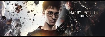
 Harry Potter Harry Potter
This is a sig i made some few minutes ago C&C
-
Starting off, Your back ground looks like an ordinary gradient, this could just be me, but thats what it looks like, i really like the splashing on the sides, and the difference?? overlay with the vetor like object fading out, the render i think may be just a little to bright for the sigs background, and the bright white on the left hand side, well im not sure, not my favorite sig you have done but i like your text placement once again, with the grey scale going in, i love that. so overall, removing the count of the bg(change bg, imo),8+/10.
Newest:

Favorite:

-
i personnaly dont like it much its a bit weir its got a freaky glow at bottom whitch is a turn off and the black white and grey before your text is weird too

    ")      
 [((_CRAYOLA_((]>[((_CRAYOLA_((]>[((_CRAYOLA_((]>[((_CRAYOLA_((]>[((_CRAYOLA_((]>[((_CRAYOLA_((]>
-
I cant get rid of that bright think since that is a part of the original Stock, thx for comment were do you think it looks like a gradient?
-
 Originally Posted by Skatanic_

i personnaly dont like it much its a bit weir its got a freaky glow at bottom whitch is a turn off and the black white and grey before your text is weird too
Okay maybe ill get rid of those thx for commenting
-
Originally Posted by Daemon
Okay maybe ill get rid of those thx for commenting
I actually liek it a lot deamon. Its not quite as great as your james bond one IMO but i def. like teh chaoticness of the sig..
Btw how was france, and did u get any good photos?
 My DevART
RATCHET is my bitch
Andrew says:
u ever stolen a bible?
Apathy says:
no
used the last two pages to roll a joint though
Andrew says:
wow
thats fucking hard core
^^HAHAHA, dm sucks XD
-
Thx for commenting papa, france was great
-
Not bad at all...I dont really like the white and gray box by ur name..and the light under his chest is a nice effect...but I dont understand why it is there...may have been a little better without it. I was wondering what those blotches were...and now that I look closely it looks like characters from the movie that had bits of them erased. Anyways i liked the sig...8/10
Latest

First Sig

-
Great
Great work once again 10/10!!
-
It's a great sig, but the yellow glow effects on the bottom and top don't go with the flow of the pick. Maybe changing it to a different color and removing it would be nice. Other than that great sig. 9/10
Similar Threads
-
By Neiromaru in forum Digital Art
Replies: 0
Last Post: 07-14-2007, 05:21 PM
-
By pearlized in forum Sigs & Manips
Replies: 8
Last Post: 06-06-2007, 04:02 PM
-
By Relentless in forum The Void
Replies: 19
Last Post: 08-20-2006, 08:07 PM
-
By skow in forum Sigs & Manips
Replies: 5
Last Post: 08-17-2005, 01:13 PM
-
By Adam in forum The Void
Replies: 20
Last Post: 08-05-2005, 01:44 AM
 Posting Permissions
- You may not post new threads
- You may not post replies
- You may not post attachments
- You may not edit your posts
-
Forum Rules
|


 Reply With Quote


