0 members and 527 guests
No Members online

» Site Navigation
» Stats
Members: 35,442
Threads: 103,075
Posts: 826,688
Top Poster: cc.RadillacVIII (7,429)
|
-
RF Online =]

i like the outcome of this one. =]
-----------------------
To end it all

To start anew
-
cool beans. looks crisp and has depth.
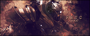
i don't like the dimensions though, and the text is blurry/unclear. it could use greater contrast overall, with some levels or color balance layers. the fact that it's all generally the same color except that blue makes that stand out a lot more than it should. if you don't want to add more blue to the sig, just add a hue/saturation layer and desaturate that part a lot. it'll look much better.
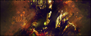
oh, and don't use png for this kinda stuff - it sucks at optimization. for that sig you want to go with jpg.
overall though, solid.
Last edited by Jeff; 07-28-2007 at 06:55 PM.
-
^^ all that josh said. And really consider making your canvas size different.
Similar Threads
-
By *JFM* in forum The Void
Replies: 14
Last Post: 04-06-2006, 08:13 PM
-
By HeadShot in forum Sigs & Manips
Replies: 6
Last Post: 08-04-2005, 12:28 PM
-
By Arkanian in forum Sigs & Manips
Replies: 4
Last Post: 08-01-2005, 03:15 AM
-
By Jake in forum The Void
Replies: 9
Last Post: 06-23-2005, 03:24 PM
-
By rapidx in forum The Void
Replies: 6
Last Post: 05-17-2005, 01:59 PM
Posting Permissions
- You may not post new threads
- You may not post replies
- You may not post attachments
- You may not edit your posts
-
Forum Rules
|