0 members and 15,067 guests
No Members online

» Site Navigation
» Stats
Members: 35,442
Threads: 103,075
Posts: 826,688
Top Poster: cc.RadillacVIII (7,429)
|
-
Layout, Opinions Please
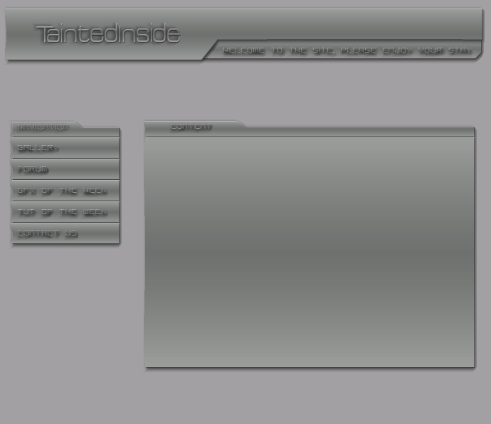
Hey everybody, please give me your opinions on this layout I just created..
It is my first ever, so I know that it is not very good, but I would still like your thoughts anyway..

-TaintedInside
-
Well for a first layout its pretty cool 
The text needs altering though, make it brighter i would say.
The layout has a dull feel to it at the moment, you need some brightness in there to create a well balanced contrast. Also the spacing between the header & navbar/content area is rather large, i will make that smaller so there is less negative space.
Other than that, its a cool layout for a first go. Nothing is overally presented and the shapes, colours compliment each other.
Its just the text 
Nice work i look forward to seeing your site when its completed
-
Thankyooooooooou Im not sure if itll ever be finished, I mainly concentrate on signatures
-
Like stated, text and lighting needs work.
The whole site is very monochromatic, add some color!
-
The text is quite hard to read, i'd stick with Arial & either dropshadow or no blending options.
Some darker grey, and bright green... might look good
-
Thanks everybody
-
I would add a footer as well, and try to fill in some of the blanks.
Similar Threads
-
By Vulcan in forum Sigs & Manips
Replies: 2
Last Post: 06-03-2007, 09:35 PM
-
By MikeLohmer in forum Sigs & Manips
Replies: 7
Last Post: 06-02-2006, 06:53 PM
-
By ShadowWolf in forum Sigs & Manips
Replies: 4
Last Post: 02-11-2006, 10:12 AM
-
By Sumomo in forum Sigs & Manips
Replies: 7
Last Post: 12-11-2005, 12:20 PM
-
By DemonDan in forum Sigs & Manips
Replies: 16
Last Post: 06-24-2005, 05:57 AM
Posting Permissions
- You may not post new threads
- You may not post replies
- You may not post attachments
- You may not edit your posts
-
Forum Rules
|