0 members and 9,050 guests
No Members online

» Site Navigation

» Stats
Members: 35,442
Threads: 103,075
Posts: 826,688
Top Poster: cc.RadillacVIII (7,429)
|
-
 please critique my first.... please critique my first....
this is the first time I've posted a picture after looking through some great tutorials from this site. Please critique. Pick it apart. Let me know what I need to improve on and everything. I don't mind if you are picky with it either. Thanks in advance. 
For me. I don't know, I'm just not completely satisfied with it. It just comes out kinda flat and just 2 dimensional. I feel like it needs something more to it.
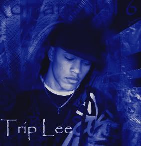
without the blue gradient map:

btw, this isn't me in the picture, he's a christian rapper I listen to.
Last edited by samson; 09-01-2007 at 10:47 PM.
-
First few things I can think of are.
- There is nothing "containing" your image. Add a border of some kind.
- The text "Romans 1:16" is off of the picture, that should be adjusted.
- The text in general can use some work.
- I think the blending needs work, but I am not the best to voice on that.

Commissions and stickers available via linktree here.
-
any suggestions on what I should try doing? Thanks for the input by the way. I'll take this all in. I wanna be as good as I can possibly be
-
i agree with de. all that is missing
-
Any suggestions Daemon? I tried this after reading through your Dragon Tut.
-
^ lol
it seems like a basic filter whored image with not a lot of thought behind it.
the blending in the right bottom corner is a lot better then the other parts, try blending like that more. the text seems out of place, and the image itself is rather small.
-
Yeah, I did go a little crazy with the filters, lol . I wasn't really sure what to look for or what I wanted to do. I'll try and figure out what I did at the bottom right corner like you said. I guess I'll keep practicing with it too. Thanks again. I'll post pictures of my practice photos up again in this thread.
-
I like your attitude!
Keep at it.
-
Why add a blur gradient map? Why not add diffrent gradient maps on diffrent blending modes and a colour balance adjustment layer? If you don't know how to do that, you click on the black and white circle at the bottom of the layer screen. Clcik on that and there are many adjustment layers you can test out. Experiment with them until you find something you like  . Try adding some splatter brushes with clipping masks. To do this, brush on a new layer with some splatter brushes and then make a new layer, apply image and right click on the layer, then click on clipping mask. Also try adding some lighting to the tag to imrpove the focal. Maybe use a soft brush with a colour on linear dodge? Don't use that many filter too. Try smudging and keep the brushing on the low. Overall, thats pretty good for a begginer. I know my first was a total flop. Looks up some tutorials/videos and stuff Or check out my tutorial on the resources section that comes with a PSD . Try adding some splatter brushes with clipping masks. To do this, brush on a new layer with some splatter brushes and then make a new layer, apply image and right click on the layer, then click on clipping mask. Also try adding some lighting to the tag to imrpove the focal. Maybe use a soft brush with a colour on linear dodge? Don't use that many filter too. Try smudging and keep the brushing on the low. Overall, thats pretty good for a begginer. I know my first was a total flop. Looks up some tutorials/videos and stuff Or check out my tutorial on the resources section that comes with a PSD 
-
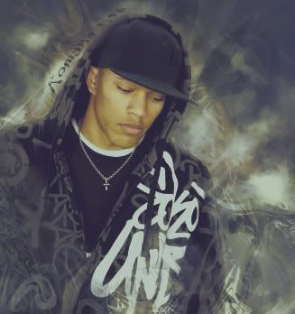
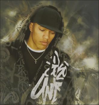
I started over and did some more practicing. I took the advice you guys were giving me and tried it out, let me know what you think. I know I still have a lot to learn. I think it looks a lot better than the first picture I posted
first practice:
second practice:
Last edited by samson; 09-06-2007 at 06:44 AM.
Similar Threads
-
By Xtremerunnerars in forum Digital Art
Replies: 6
Last Post: 04-25-2008, 03:27 PM
-
By trooper92 in forum Sigs & Manips
Replies: 7
Last Post: 05-01-2007, 11:28 AM
-
By Roy in forum Sigs & Manips
Replies: 2
Last Post: 11-25-2005, 01:02 AM
-
By Daemon_ in forum Digital Art
Replies: 1
Last Post: 08-13-2005, 02:33 PM
-
By Digifruitella in forum Sigs & Manips
Replies: 17
Last Post: 02-09-2005, 03:03 PM
 Posting Permissions
- You may not post new threads
- You may not post replies
- You may not post attachments
- You may not edit your posts
-
Forum Rules
|


 Reply With Quote


