GFXVoid Graphic Design Forum

Remove Text Formatting
Loading...

» Online Users: 23,834

0 members and 23,834 guests
No Members online

» Site Navigation

 > FAQ

» Stats

Members: 35,442
Threads: 103,075
Posts: 826,688
Top Poster: cc.RadillacVIII (7,429)
Welcome to our newest member, Lekelindids
Page 1 of 2 12 LastLast
Results 1 to 10 of 11

Thread: Maybe my best?

  1. #1
    Join Date
    Jun 2007
    Posts
    129

    Default Maybe my best?

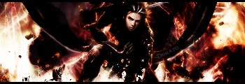
    Idk this might be my best or atleast next to the halo one I made I'm not sure. I tried to combine just about everything I know into the sig but it came out pretty weird so I took some stuff off. um the text probably needs work but that's not what I'm trying to focus on at the moment. I'm just trying to better my sigs including depth focus flow etc. I'm not sure if I got any of that in here but thats up to you to decide. CnC please

    :Latest:
    :Favorite:

  2. #2

    Default

    i cant see the text mate...

  3. #3
    Join Date
    Jun 2007
    Posts
    129

    Default

    Yeah I couldn't find a good place to put it and I didn't want it to stand out as much and I'm horrible with text anyway so I just stuck it there O_o
    :Latest:
    :Favorite:

  4. #4
    Join Date
    May 2006
    Posts
    1,729

    Default

    i think it's overcontrasted. tone it down a bit. that'll make the text easier to place as well.

  5. #5
    Join Date
    Aug 2007
    Location
    Philippines \m/
    Posts
    331

    Default

    it is too dark..


    Proud Member Of MasterWorks® Family

  6. #6
    Join Date
    Dec 2006
    Posts
    1,270

    Default

    Yea. For me, its not too dark at all. But I do have a ridiculously bright monitor. (which I love.)
    The thing that looks best to me, is how the whole motion of the sig is consistent.
    Everything is flowing towards the top right corner, and I really like that.
    Fav:


    Newest:


  7. #7
    Join Date
    Aug 2007
    Location
    Philippines \m/
    Posts
    331

    Default

    all i can see bright is the face and the edges of the render ;(


    Proud Member Of MasterWorks® Family

  8. #8
    Join Date
    Jun 2007
    Posts
    129

    Default

    Brahma I think your screen might be a bit messed up cause it's not dark at all O_o
    :Latest:
    :Favorite:

  9. #9
    Join Date
    Dec 2006
    Posts
    1,270

    Default

    Edit: Tutorial by Mannos:
    If you're having trouble with coloring on your PS and monitor, check this out.
    http://www.gfxvoid.com/forums/showth...hlight=monitor
    Last edited by [PHXN] New001; 09-03-2007 at 10:08 PM.
    Fav:


    Newest:


  10. #10
    Join Date
    Aug 2007
    Location
    Philippines \m/
    Posts
    331

    Default

    oh yea maybe this just my screen.. im at school so the quality might not be good XD


    Proud Member Of MasterWorks® Family

Posting Permissions

  • You may not post new threads
  • You may not post replies
  • You may not post attachments
  • You may not edit your posts
  •  
Powered by vBadvanced CMPS v4.1.1